Understanding Solace Insights Dashboards for Advanced Monitoring
When you enable Solace Insights Advanced Monitoring, you have access to the rich Solace Insights dashboards for Datadog that provide you with visualizations of the monitors and metrics. You can use these dashboards as-is, clone them to create customized dashboards, or even create your own dashboards using the provided ecosystem of monitors and metrics in Insights.
All the Solace Insights dashboards provided are organized in a similar manner. Before you look at the details of each dashboard, review the information in Solace Insights Advanced Monitoring to gain a basic understanding of how the Insights function.
These are the Solace Insights dashboards that Solace provides:
- Appliance Health Overview
- Bridges Overview
- Capacity Overview
- Certificate Expiry Overview
- Estate Overview
- Kafka Bridges Overview
- Message Flow Overview
- Message Flow Trends
- Queues Overview
- Understanding Solace Insights Dashboards for Advanced Monitoring
- Replication and DR Overview
- Scale Capacity Overview
- Topic Endpoints Overview
Each dashboard has a version associated with it so that you can understand what changes occur between releases. For more information about the releases, see About Solace Insights Dashboards for Datadog Releases.
For an understanding of how the metrics are collected and visualized, see the following topics:
- Using Service-Level Dashboards for Event Broker Services
- Using Service-Level Dashboards for Event Broker Services
For a list of available metrics that can be collected, see the following topic:
About Solace Insights Dashboards for Datadog Releases
Each Solace Insights dashboards for Datadog that Solace provides in Datadog has a three-segment version number with the notation X.Y.Z (e.g., 1.4.5). For more information about updates to the Solace Insights dashboards, see the release notes at Solace Cloud Releases.
You can use search on "dashboard" to find all the entries in the release notes related to Solace Insights dashboards.
The version information for a given Solace Insights dashboards might be useful to you if you've cloned one of them and want to see what changes might be useful to port to your cloned dashboard, want to understand backward compatibility of your cloned dashboards, or simply want to see what has changed and what new monitoring capabilities are available. For the version number, each segment increments as follows:
- X — Incompatible release changes that include:
- Functional changes to dashboards that may include the context and purpose of a dashboard.
- May also include changes that require a specific dependency or prerequisite to the dashboard that are no longer backward compatible with previous iterations of a dashboard.
- Y — Major release changes that include:
- Significant changes to the dashboards that may include additions, changes, or deletions of the visualizations utilized for widgets.
- May also include backward-compatible changes to monitors, and metrics shown on a dashboard.
- Z — Minor release changes that include:
- Visual changes to a dashboard that can include layout, the metrics or monitor used, and widgets utilized.
- May include minor changes to text shown or editorial changes.
- All minor changes are backwards-compatible with previous dashboards.
To determine the version of a dashboard, click the name of the dashboard near the top, and the version is listed at the end of the brief description as shown in the following diagram:
About Last Values in Metrics in Solace Insights Dashboards
It is important to note that if the title of a widget in the dashboard is prefixed by the word 'last', the value shown is the last value collected by the metric at the end of the selected timeframe. For example, you selected the last hour as the timeframe, and the Last Services metric shows a value of 2. That value comes from the last time the metric was updated for that one hour time frame. The value is not an average of the timeframe, or derived from a timeframe's total.
Appliance Health Overview
-
This dashboard is available for Insights for self-managed appliance event brokers only.
-
The Insights Agent automatically detects your broker type and sets the
peb_typetag. This dashboard appears only when the agent detects an appliance event broker (peb_type:appliance). For more information about configuring the agent, see Enabling Insights for appliance event brokers.
The Appliance Health Overview dashboard provides operational visibility into the hardware health and environmental conditions of appliance event brokers.
This dashboard helps you monitor appliance event broker hardware health and answer questions such as:
- Are any hardware components in a failed state (sensors, disks, HBA links, power redundancy)?
- Are the environmental conditions (temperature, fan speed) within acceptable ranges?
- What is the status of network interfaces for management and messaging traffic?
- How is resource utilization trending (memory, disk, NAB buffers, interface bandwidth)?
Operations teams use this dashboard to monitor appliance event broker hardware health, identify environmental issues before they cause outages, and troubleshoot hardware-related performance problems.
Related Dashboards
The following related dashboards may be helpful when viewed in parallel with this dashboard:
Details of the Appliance Health Overview Dashboard
The dashboard provides visualizations of hardware health, environmental metrics, and resource utilization for appliance event brokers.
Last values are from the end of a selected timeframe. For more information, see About Last Values in Metrics in Solace Insights Dashboards.
The dashboard includes the following components:
- Summary
- A section that provides an at-a-glance view of critical hardware health indicators across your appliance event broker estate:
-
- Sensors Down: A query value widget that shows the count of appliance event brokers with any sensor in a failed state (excluding power redundancy).
- POST Failed: A query value widget that shows the count of appliance event brokers where Power-On Self-Test has failed.
- Disk Down: A query value widget that shows the count of appliance event brokers with a disk in a failed state.
- HBA Link Down: A query value widget that shows the count of appliance event brokers with a Host Bus Adapter link down.
- ADB Link Down: A query value widget that shows the count of appliance event brokers with an Assured Delivery Blade link down.
- Power Redundancy Down: A query value widget that shows the count of appliance event brokers where power supply redundancy has been lost.
- NPU Temp High ≥95°C: A query value widget that flags any Network Processing Unit running at or above 95°C.
- Fan Speed Low ≤1000: A query value widget that flags any mainboard fan spinning at or below 1000 RPM.
- Appliance Hardware Monitors: A monitor summary widget that shows a live status feed for all hardware-related monitors.
- Hardware Status
- A section with query table widgets that let you identify which specific component on which appliance event broker is in a failed state:
-
- Sensors: A query table widget that shows per-sensor operational status, grouped by service, host, sensor type, and sensor name.
- POST: A query table widget that shows Power-On Self-Test results per appliance event broker, grouped by service and host.
- Disk: A query table widget that shows per-disk health status, grouped by service, host, and disk number.
- HBA Link: A query table widget that shows per-HBA-link connectivity status, grouped by service, host, and link name.
- ADB Link: A query table widget that shows Assured Delivery Blade link status per appliance event broker, grouped by service and host.
- Power Redundancy: A query table widget that shows power supply redundancy status per appliance event broker, grouped by service and host.
- Environmental Health
- A section with timeseries widgets that show environmental sensor readings over time to help you spot overheating or fan degradation:
-
- NPU Temperature: A timeseries widget that shows temperature readings from NPU sensors over time, split by service and slot. Temperature is measured in degrees Celsius (°C).
- Fan Speed: A timeseries widget that shows mainboard fan speed over time, split by service and sensor. Fan speed is measured in revolutions per minute (RPM).
- Network Interfaces
- A section with query table widgets that show the operational state of each network interface:
-
- Management Interfaces: A query table widget that shows the status of interfaces used for appliance event broker management traffic.
- Messaging Interfaces: A query table widget that shows the status of interfaces used for message data-plane traffic.
- Capacity & Utilization
- A section with timeseries widgets that show resource consumption trends to help you identify appliance event brokers approaching capacity limits:
-
- Physical Memory Usage: A timeseries widget that shows the percentage of physical memory consumed over time.
- Subscription Memory Usage: A timeseries widget that shows the percentage of subscription memory consumed over time.
- NAB Buffer Load Factor: A timeseries widget that shows Network Acceleration Blade buffer utilization over time. Higher values indicate the buffer is closer to saturation.
- NAB AD Cache Utilization: A timeseries widget that shows Network Acceleration Blade Assured Delivery cache usage percentage over time.
- Disk Usage: A timeseries widget that shows disk space utilization over time.
- Interface TX Bandwidth: A timeseries widget that shows outbound (transmit) bytes per interface over time.
- Interface RX Bandwidth: A timeseries widget that shows inbound (receive) bytes per interface over time.
Bridges Overview
The Bridges Overview dashboard provides an understanding of bridges (Message VPN bridges). Bridges link two event broker services . A bridge ensures that messages published to one service that match the subscriptions for the bridge are also published to the linked event broker service. This dashboard provides an overview of bridges in your event broker services.
This dashboard gives you an overall sense of event broker service usage and answers questions such as:
- What is the operational status of my bridges?
- Are messages flowing smoothly across my bridges?
Application Support teams often use this dashboard to analyze bridge usage, identify potential issues with bridges, and to identify whether additional investigation is required.
Related Dashboards
The following related dashboards may be helpful when viewed in parallel with this dashboard:
Details of the Bridges Overview Dashboard
The top section is a brief overview of the number of bridges, messages sent and received over the bridges, and the Bridge Monitor Count and Status. The metrics provide an overview of messages across the bridges in your estate that include:
- all incoming and outgoing messages with a view of direct, persistent, and non-persistent metrics
- all incoming and outgoing discards
Last values are from the end of a selected timeframe. For more information, see About Last Values in Metrics in Solace Insights Dashboards.
The dashboard includes the following components:
- Bridges
- A Query Value widget that shows the status of bridges in the estate.
- Total Messages Sent
- A query value widget that shows the total messages sent by clients over the bridge.
- Total Messages Received
- A query value widget that shows the total messages received by clients over the bridge.
- Bridge Monitor Counts & Status
- A monitor summary widget that represents the number of VPN-scoped monitors watching your bridges (not the number of alerts or warnings). The Alert overview is a histogram of alerts for the selected time period. The Alert/Warn number is the number of monitors that have Alerts or Warning states, and OK is the number of monitors in the OK state. The table that’s below the Alert/Warn and OK numbers is a list of monitors and the count of the instances of that monitor triggered in various states - Alert, Warn, OK.
- Incoming Messages
- A section that shows the rates of different incoming messages over the bridge, graph, and the high water mark (HWM) for the timeframe selected.
-
- Last Msgs In Rate: A query value widget that shows the last incoming message rate (messages per second) on the selected bridges.
- Incoming Message Rate on Bridges (msgs/sec): A timeseries widget that shows a graph of the incoming message rate (messages per second) over the selected time interval.
- HWM Msgs In Rate: A query value widget that shows the highest value for the incoming message rate for the time interval selected.
- Last Direct Msgs In Rate: A query value widget that shows the last incoming Direct message rate (messages per second) on the selected bridges.
- Incoming Direct Message Rate on Bridges (msgs/sec): A timeseries widget that shows a graph of the incoming Direct message rate (messages per second) over the selected time interval.
- HWM Direct Msgs In Rate: A query value widget that shows the highest value for the incoming Direct message rate for the time interval selected.
- Last Persistent Msgs In Rate: A query value widget that shows the last incoming Persistent message rate (messages per second) on the selected bridges.
- Incoming Persistent Message Rate on Bridges (msgs/sec): A timeseries widget that shows a graph of the incoming Persistent message rate (messages per second) over the selected time interval.
- HWM Persistent Msgs In Rate: A query value widget that shows the highest value for the incoming Persistent message rate for the time interval selected.
- Last Non-Persistent Msgs In Rate: A query value widget that shows the last incoming Non-Persistent message rate (messages per second) on the selected bridges.
- Incoming Non-Persistent Message Rate on Bridges (msgs/sec): A timeseries widget that shows a graph of the incoming Non-Persistent message rate (messages per second) over the selected time interval.
- HWM Non-Persistent Msgs In Rate: A query value widget that shows the highest value for the incoming Non-Persistent message rate for the time interval selected.
- Last Msgs In Rate: A query value widget that shows the last incoming message rate (messages per second) on the selected bridges.
- Outgoing Messages
- A section that shows the rates of different outgoing messages over the bridge, graph, and the high water mark (HWM) for the timeframe selected.
-
- Last Msgs Out Rate: A query value widget that shows the last outgoing message rate (messages per second) on the selected bridges.
- Incoming Message Rate on Bridges (msgs/sec): A timeseries widget that shows a graph of the outgoing message rate (messages per second) over the selected time interval.
- HWM Msgs Out Rate: A query value widget that shows the highest value for the outgoing message rate for the time interval selected.
- Last Direct Msgs Out Rate: A query value widget that shows the last outgoing Direct message rate (messages per second) on the selected bridges.
- Outgoing Direct Message Rate on Bridges (msgs/sec): A timeseries widget that shows a graph of the outgoing Direct message rate (messages per second) over the selected time interval.
- HWM Direct Msgs Out Rate: A query value widget that shows the highest value for the outgoing Direct message rate for the time interval selected.
- Last Persistent Msgs Out Rate: A query value widget that shows the last outgoing Persistent message rate (messages per second) on the selected bridges.
- Outgoing Persistent Message Rate on Bridges (msgs/sec): A timeseries widget that shows a graph of the outgoing Persistent message rate (messages per second) over the selected time interval.
- HWM Persistent Msgs Out Rate: A query value widget that shows the highest value for the outgoing Persistent message rate for the time interval selected.
- Last Non-Persistent Out Rate: A query value widget that shows the last outgoing Non-Persistent message rate (messages per second) on the selected bridges.
- Outgoing Non-Persistent Message Rate on Bridges (msgs/sec): A timeseries widget that shows a graph of the outgoing Non-Persistent message rate (messages per second) over the selected time interval.
- HWM Non-Persistent Msgs Out Rate: A query value widget that shows the highest value for the outgoing Non-Persistent message rate for the time interval selected.
- Last Msgs Out Rate: A query value widget that shows the last outgoing message rate (messages per second) on the selected bridges.
- Incoming Discards
- A section that shows the incoming message discarded by the bridges:
-
- Last Discards In: A query value widget that shows the last number of incoming messages that were discarded by the bridges.
- Last Discards In Rate: A query value widget that shows the last rate (messages per second) of incoming messages that were discarded by the bridges.
- Bridge Incoming Discards Rate (msgs/sec): A timeseries widget that shows a graph of the rate (messages per second) of incoming messages that were discarded by the bridges over the selected time interval.
- Outgoing Discards
- A section that shows the outgoing messages discarded by the bridges:
- Last Discards Out: A query value widget that shows the last number of outgoing messages that were discarded by the bridges.
- Last Discards Out Rate: A query value widget that shows the last rate (messages per second) of outgoing messages that were discarded by the bridges.
- Bridge Outgoing Discards Rate (msgs/sec): A timeseries widget that shows a graph of the rate (messages per second) of outgoing messages that were discarded by the bridges over the selected time interval.
- Bridges
-
A table widget that lets you look at the current state of key metrics by bridges. The table includes detailed information about the incoming/outgoing messages rates and incoming/outgoing discard rates by bridge name. You can also use the Search to filter on the name of the Bridge (
BRIDGE_NAME). Alternatively, you can use the filters at the top of this dashboard to filter what is shown in the tables.
Capacity Overview
The Capacity Overview dashboard provides a strategic view of your estate resource utilization. This dashboard assesses the current values, high water marks for the selected periods, and shows trends over time to better analyze how close your usage is to the limits of your event broker service and enable better planning.
This dashboard gives you an overall sense of service usage and answers questions such as:
- Am I running close to limits?
-
Am I over allocating resources?
Operations, Integration, and Application Support teams often use this dashboard to help analyze current capacity, and identify potential increases and where allocated resources are being under utilized.
Related Dashboards
The following related dashboards may be helpful when viewed in parallel with this dashboard:
Details of the Capacity Overview Dashboard
When this dashboard is not filtered by service, some of the trend line charts show the percentage utilization by service as specified in the titles - one line per service.
Each object on the dashboard can be expanded to see more context.
The top section is a brief overview of metrics that are useful to understand the capacity of your estate. On this dashboard, there are percentage utilization metrics that reflect the current value as a percent of the limit for that resource for your selected service. The line graphs have thresholds showing at 80% (the warn threshold for most monitors) and 95% (the alert threshold for most monitors).
Last values are from the end of a selected timeframe. For more information, see About Last Values in Metrics in Solace Insights Dashboards.
The dashboard includes the following components:
- Client Connections
- A section that shows all the client connection metrics.
-
- Last Connections: A query value widget that shows the last number of current connections in use.
- Last % Util Connections: A query value widget that shows the last percentage of the maximum connections that are in use.
- Client Connections Utilization (%) by Service: A timeseries widget that shows a graph with the percentage of all connections.
- HWM Connections: A query value widget that shows the highest number (high water mark) of connections during the selected time interval.
- Min Connections: A query value widget that shows the lowest number of connections during the selected time interval.
- Avg Connections: A query value widget that shows the average number of connections during the selected time interval.
- Client Connections by Protocol
- A section that shows metrics for connections to the event broker services.
-
- Last MQTT Connections: A query value widget that shows the last number MQTT connections.
- Last % Util MQTT Connections: A query value widget that shows the last percentage of maximum connections that are MQTT connections.
- MQTT Client Connection Utilization (%): A timeseries widget that shows a graph with the utilization (as a percentage) of MQTT connections over a time interval.
- HWM MQTT Connections: A query value widget that shows the highest number (high water mark) of MQTT connections during the selected time interval.
- Last Current REST In Connections: A query value widget that shows the last number of incoming REST requests.
- Last % Util REST In Connections: A query value widget that shows the last percentage of maximum client connections that are incoming REST requests.
- Incoming REST Client Connection Utilization (%): A timeseries widget that shows a graph with the utilization (as a percentage) incoming REST requests over the selected time interval.
- HWM REST In Connections: A query value widget that shows the highest number (high water mark) of incoming REST requests during the selected time interval.
- Last Current REST Out Connections: A query value widget that shows the last number of outgoing REST requests.
- Last % Util REST Out Connections: A query value widget that shows the last percentage of maximum client connections that are outgoing REST requests.
- Outgoing REST Client Connection Utilization (%): A timeseries widget that shows a graph with the utilization (as a percentage) of outgoing REST requests over the selected time interval.
- HWM REST Out Connections: A query value widget that shows the highest number (high water mark) of outgoing REST requests during the selected time interval.
- Last Current SMF Connections: A query value widget that shows the last number (SMF) connections.
- Last % Util SMF Connections: A query value widget that shows the last percentage of maximum connections that are SMF connections.
- SMF Client Connection Utilization (%): A timeseries widget that shows a graph with the number SMF connections over the selected time interval.
- HWM SMF Connections: A query value widget that shows the highest number (high water mark) of SMF connections during the selected time interval.
- Last Current Web Connections: A query value widget that shows the last number of Web (HTTP-based) connections.
- Last % Util Web Connections: A query value widget that shows the last percentage of maximum connections that are Web connections.
- Web Client Connection Utilization (%): A timeseries widget that shows a graph with the number Web connections over the selected time interval.
- HWM Web Connections: A query value widget that shows the highest number (high water mark) of Web connections during the selected time interval.
- Last Current AMQP Connections: A query value widget that shows the last number AMQP connections.
- Last % Util AMQ Connections: A query value widget that shows the last percentage of maximum connections that are AMQP connections.
- AMQP Client Connection Utilization (%): A timeseries widget that shows a graph with the number AMQP connections over the selected time interval.
- HWM AMQP Connections: A query value widget that shows the highest number (high water mark) of AMQP connections during the selected time interval.
- Last MQTT Connections: A query value widget that shows the last number MQTT connections.
- Guaranteed Messaging Spool
- A section that shows the metrics related to show Guaranteed Messages (Persistent) and Message Spool capacity.
-
- Last Spool Size: A query value widget that shows the last spool size available, as megabytes.
- Last % Util Spool: A query value widget that shows the last percentage of the message spool total availability that is used.
- Guaranteed Message Spool Utilization (%) by Service: A timeseries widget with a graph that shows the usage of the Message Spool as a percentage of the total spool size. This is shown by event broker service.
- HWM Spool Size: A query value widget that shows the highest value (high water mark) of spool usage in megabytes.
- Last Spool File (%): A query value widget that shows the last spool file usage as percentage.
- Last Delivered Unacked Msgs Util: A query value widget that shows the last number of messages that have been delivered to clients but have not been acknowledged by them.
- Last Msgs Spooled: A query value widget that shows the last number of messages that are spooled.
- Last % Msgs Spooled: A query value widget that shows the last number of messages that are spooled as percentage of the maximum available capacity.
- Messages in Spool Utilization (%) by Service: A timeseries widget with a graph that shows the utilization of the Message Spool as percentage of the maximum available capacity. This is shown by event broker service.
- HWM Msgs Spooled: A query value widget that shows the highest value (high water mark) of messages that are spooled in a time interval.
- Last Incoming Flow (%): A query value widget that shows the last number of incoming flows as a percentage of the limit.
- Last Outgoing Flow (%): A query value widget that shows the last number of outgoing flows as a percentage of the limit.
- Last Tran Session (%): A query value widget that shows the last number of transacted sessions as a percentage of the transacted session capacity.
Certificate Expiry Overview
The Certificate Expiry dashboard helps you track and manage the lifecycle of certificates configured on your event broker services. It provides visibility into certificate expiration dates across your estate, helping you proactively renew certificates before they expire and cause service disruptions.
This dashboard gives you an overall view of certificate health and helps answer questions such as:
- Which certificates are approaching expiration?
- Are there any certificates that require immediate attention?
- What is the overall certificate health across my estate?
Operations and Security teams use this dashboard to maintain certificate compliance and prevent service outages caused by expired certificates.
Related Dashboards
The following related dashboards may be helpful when viewed in parallel with this dashboard:
Details of the Certificate Expiry Overview Dashboard
The dashboard displays certificate expiration information organized by certificate type. Each table is color-coded to indicate urgency, with certificates sorted by expiration date (soonest to expire first). You can filter the dashboard by environment, service name, and Message VPN name.
The dashboard includes the following components:
- Impacted Summary
-
-
Services - critical (< 15d): A scalar widget showing the count of services that have at least one certificate expiring in fewer than 15 days.
-
Services - expiring (< 30d): A scalar widget showing the count of services with at least one certificate expiring in fewer than 30 days.
-
Impacted services – cert types under 30 days: A table that only shows services with at least one cert type below the 30-day threshold. The table includes information about the service name, service ID, the total count of certificate types impacted, VPN bridge client certificate status, client authentication CA status, domain validation CA status, Kafka sender client certificate status, Kafka receiver client certificate status, RDP REST consumer client certificate status, and OAuth profile client certificate status. The rows are color-coded based on how soon the certificate expires to help you prioritize renewals
-
- Monitor Status
- A monitor summary widget that represents the alert state of the Certificate Expiry Monitoring watching your event broker services. Alert and Warn show the number of certificate monitors in the Alert or Warning states, and OK shows the number of monitors in the OK state.
- Certificate Expiry Details
-
A series of table widgets showing certificate expiration statuses for each certificate type you manage by event broker service:
- Bridge Certificates: Displays expiration information for certificates used by Message VPN bridges.
- Client Certificate Authority: Displays expiration information for certificate authority (CA) certificates used for client authentication.
- Domain Certificate Authority: Displays expiration information for CA certificates used for domain validation.
- Kafka Sender Certificate: Displays expiration information for certificates used by Kafka senders.
- Kafka Receiver Certificate: Displays expiration information for certificates used by Kafka receivers.
- RDP REST Consumer Certificate: Displays expiration information for certificates used by REST Delivery Points.
- OAuth Profile Certificate: Displays expiration information for certificates used by OAuth profiles.
The table for each certificate type includes information about the service name, service ID, host, Message VPN name, certificate names (under different headings, for example, bridge or CA), common name, and days to expiry of the installed certificate. Rows are color-coded based on how soon the certificate expires to help you prioritize renewals.
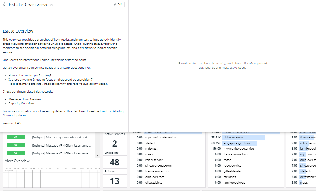
Estate Overview
The Estate Overview dashboard provides a snapshot of key metrics and monitors to help you quickly identify areas that require attention across your estate.
This dashboard gives you an overall sense of service usage and answers questions such as:
- How is your event broker service performing?
- Is there anything I need to focus on that could be a problem?
- How can I get to the information that I need to identify and resolve availability issues?
Operations and Integration teams use this as a starting point to understand what's occurring in their deployment.
Related Dashboards
The following related dashboards may be helpful when viewed in parallel with this dashboard:
Details of the Estate Overview Dashboard
The top section is a brief overview of key information from across your account for Solace Cloud, including alerts that you may wish to act on, current resources, and key trends with top services for message rates, spooled messages, and connections/active accounts. It includes the following information:
The dashboard includes an Event Broker Type template variable that allows you to filter the dashboard by broker type: Solace Cloud event broker services, software event brokers, or appliance event broker. The default setting (*) shows data for all broker types. The Insights Agent automatically detects and sets the peb_type tag for proper filtering and display.
Last values are from the end of a selected timeframe. For more information, see About Last Values in Metrics in Solace Insights Dashboards.
The dashboard includes the following components:
- Metric Monitor Counts & Status
- A monitor summary widget that represents the number of metric-based monitors (not the number of alerts or warnings) watching the event broker services in your estate. The Alert/Warn number is the number of metric-based monitors that have Alerts or Warning states, and OK is the number of monitors in the OK state. The table that’s below the Alert/Warn and OK numbers is a list of monitors and the count of the instances of that metric-based monitor triggered in various states - Alert, Warn, OK.
- Metric Alert Overview
- An event timeline widget that shows a graph of the alerts in your estate in the selected interval for metric-based monitors.
- Log Monitor Counts & Status (last 5 minutes)
- A monitor summary widget that represents the log-based monitors watching the event broker services in your estate. A status of No Data (gray) indicates that there were no matching logs. A status of Alert (red) or Warn (yellow) indicates a threshold was reached or exceeded depending on the configuration of the monitor. After the five-minute interval, if the log is not seen again, it turns OK (green). After awhile, the OK (green) changes back to No Data (gray).
- Log Alert Overview
- An event timeline widget that shows a graph of monitor events that are seen in your estate in the selected interval over selected intervals.
- Resource Utilization Monitor Counts & Status
- A section is a collection of monitor summary widgets that watch specific resources and the related triggered state (not the number of alerts or warnings). This includes:
-
- Connections: A monitor summary widget showing the count of monitors that watch connections.
- Subscription: A monitor summary widget showing the monitors that watch subscriptions.
-
The Alert/Warn number is the number of monitors that have Alerts or Warning states, and OK is the number of monitors in the OK state.
If any instance of a monitor is triggered by a critical event, it raises an ‘Alert’ level event and be counted in the “Alert” bucket. If a warning has been flagged, the monitor will be counted there. The ‘OK’ number represents the number of monitors that have no instances triggered as warnings or alerts. Clicking on the numbers or the rows will take you to the Monitors section in Datadog filtered down to the selection you clicked on to help you investigate what you are seeing on the dashboard.
- Current Resources
- The section is a count of the current number of metrics in the estate that includes:
-
- Last Services: A query value widget that shows the last count of the number of event broker services in your account.
- Cloud Services: A query value widget that shows the count of event broker services in your account.
- Self-Managed Brokers: A query value widget that shows the count of software event brokers in your account.
- Appliances: A query value widget that shows the count of appliance event brokers in your account.
- Last HA Services: A query value widget that shows the last count of Enterprise type services within the account.
- Last Single Node Services: A query value widget that shows the last count of the
- Last Active Services: A query value widget that shows the last count of the number of services that have an incoming message rate greater than zero.
- Last Endpoints: A query value widget that shows the last count of the queues and topic endpoints for the event broker services within the account.
- Last Bridges: A query value widget that shows the last count of the number of Message VPN bridges in the event broker services within the account.
- Last Mesh Links: A query value widget that shows the last total number of mesh links, both up and down, in your estate.
- Last Mesh Clusters: A query value widget that shows the last total number of mesh clusters, both up and down, in your estate.
- Message Rates
- A timeseries widget that shows a graph of the one-minute averages of incoming and outgoing messages as follows:
-
- Incoming Message Rate: The rate at which messages are coming into the event broker services. Measured in messages per second.
- Outgoing Message Rate: The rate at which messages are going out of the event broker services in messages. Measured in messages per second.
- Top 10 Services by Outgoing Rate: A Top List widget that shows a list of the top ten services in your account in descending order of the event broker service's outgoing rates.
- Spooled Messages
- A timeseries widget that shows a graph of the count of the messages currently spooled on the queues and stored on the message spool.
-
- Top 10 Services by Message Spooled: A Top List widget that shows a list of the top ten services in your account in descending order based on the messages spooled.
- Connections and Active Consumers
- A timeseries widget that shows a graph of the active consumer binds and connections.
-
- Connections: The number of client connections.
- Active Consumers (bind): The count of the clients that are bound to, and consuming messages from queues and topic endpoints.
- Top 10 Services by Connections: A Top List widget that shows a list of the top ten services in the account in descending order that’s based on the number of clients connected to the services with the count of client connections.
- Mesh Status
- A section that focuses on checks that watch the readiness states for objects that impact the communication within your event meshes. This includes:
-
- Last Mesh Cluster Status: A check status widget that shows the count of the Health checks being executed watching the readiness of DMR clusters and the status of the last Health Check.
- Last Mesh Link Status: A check status widget that shows the count of the Health checks that are being executed watching the readiness of Dynamic Message Routing (DMR) links and the status of the last Health Check.
- DR Replication Monitor Counts & Status: A check status widget that shows the number of monitors watching the message replication status in your estate.
- Last Bridges - Down: A check status widget that shows the last count of the Health Checks being executed watching the readiness of static Message VPN bridges and the status of the most recent Health check.
- Last Cache Instances - Down: A check status widget that shows the last count of the checks being executed for readiness of SolCache or MQTT Retain cache if implemented.
- Other Resource Counts
- A section that contains derived metrics that count the number of queues or topic endpoints that have messages, but no clients bound to consume the messages and include:
-
- Last Queues - Messages & No Consumers: A query value widget that shows the last count of queues in the event broker services that have messages on them, but no consumers (i.e., no clients are bound to the queues).
- Last TEs - Messages & No Consumers: A query value widget that shows the last count of topic endpoints in your event broker services that have messages on them, but no consumers (i.e., no clients are bound to the topic endpoints).
- Monitored Services
- A section that shows the statuses that are monitored and managed by Solace for information purposes.
-
- Last HA Active Services: A query value widget that shows the last count of active brokers in High-Availability (HA) services.
- Last Redundancy Down: A check status widget that shows the count of checks being executed for HA and the status of the last check.
- Last Config-Sync Down: A check status widget that shows the count of the checks being executed watching the status of Config-sync and the status of the last check.
- Last Msg Spool Down: A check status widget that shows the last number and status of the Message Spool.
- Current HA Status by Service: A Host Map widget that shows the current high-availability (HA) readiness of the event brokers in each Enterprise type event broker service. The status of the monitoring node for event broker services and
- Green: Status is OK. If all event brokers are this color, High-Availability readiness (redundancy) is available (that is, it is ready to accept failovers).
- Orange:Event broker is not ready to accept failovers and High-Availability readiness is not available (or redundancy is degraded).
Note that degraded redundancy doesn't impact service operation. The operational status of a service is monitored by Solace.
- Service Stats
-
A Table widget that lets you look at the current state of key metrics by service. The table includes detailed information about various statistics for event broker services. You can use the Search to filter on the name of the event broker service (
SERVICE_NAME). - Alerts History from Monitors
- A Timeline widget that shows a timeline of events by type (Warning, Alert, and Recovery events). These are a reflection of triggers from the monitors. Alert History shows the most recent events with the time interval. You can click an event Alert History to see more detail.
- Event Broker Services Logs
-
A Log Stream widget that shows the event broker logs. You can click a log to open Log Explorer in Datadog to get more details for a specific log. From Log Explorer, you can search for additional logs, and further investigate any anomalies.
Kafka Bridges Overview
The Kafka Bridges Overview dashboard provides an understanding of the operation of the Kafka bridges in your estate. Kafka bridges integrate Kafka event brokers into your event driven architecture, allowing messages to flow between your Solaceevent broker services and your Kafka event brokers.
This dashboard provides an overview of the operational status of the Kafka bridges in your estate and answers questions such as:
- What is the operational status of my Kafka bridges?
- Are messages flowing smoothly across my Kafka bridges?
Application Support teams can use this dashboard to analyze Kafka bridge usage, identify potential issues with Kafka bridges, and identify whether additional investigation is required.
Related Dashboards
The following related dashboards may be helpful when viewed in parallel with this dashboard:
Details of the Kafka Bridges Overview Dashboard
The dashboard includes the following components:
- Kafka Overview
- This section contains 10 widgets providing an overview of the Kafka bridges in your estate:
-
- Max Kafka Connection Count: A query value widget that shows the maximum number of concurrent Kafka broker connections supported by your Solaceevent broker services.
- Total Kafka Connection Count: A query value widget that shows the total current Kafka connection count for your event broker services.
- Kafka Connections Over Time: A timeseries widget showing a graph of the number of Kafka connections for the time interval selected.
- Kafka Sender Count: A query value widget that shows the number of configured Kafka senders sending messages from one or more queues to Kafka topics.
- Kafka Sender Operational Count: A query value widget that shows the number of operational Kafka senders.
- Kafka Sender Down: A query value widget that shows the number of Kafka senders that are currently down.
- Kafka Receiver Count: A query value widget that shows the number of configured Kafka receivers consuming events from Kafka topics and publishing them to the Solaceevent broker services.
- Kafka Receiver Operational Count: A query value widget that shows the number of operational Kafka receivers.
- Kafka Receiver Down: A query value widget that shows the number of Kafka receivers that are currently down.
- Kafka Sender/Receiver Count: A timeseries widget showing a graph of the status of your Kafka senders and receivers for the time interval selected.
- Health Metrics
- This section contains four widgets providing an overview of the health of your Kafka bridges:
-
-
Kafka Sender Status: A timeseries widget showing a graph of the status (up or down) of Kafka senders for the time interval selected.
-
Kafka Receiver Status: A timeseries widget showing a graph of the status of Kafka receivers (up or down) for the time interval selected.
-
Kafka Sender Details: A table widget that shows you details about your Kafka senders, including whether they are enabled, operational (up/down), the amount of messages sent, and the volume of messages sent.
-
Kafka Receiver Details: A table widget that shows you details about your Kafka receivers, including whether they are enabled, operational (up/down), the amount of messages received, and the volume of messages received.
-
- Performance Metrics
- This section contains four widgets providing an overview of the Kafka bridges in your estate:
-
-
Sender Transmitted Message Count: A timeseries widget showing a graph of the number of messages sent by the Kafka sender for the time interval selected.
-
Sender Transmitted Message Byte Count: A timeseries widget showing a graph of the byte count for the total number of messages sent by the Kafka sender for the time interval selected.
-
Receiver Received Message Count: A timeseries widget showing a graph of the number of messages received by the Kafka receiver for the time interval selected.
-
Receiver Received Message Byte Count: A timeseries widget showing a graph of the byte count for the total number of messages received by the Kafka receiver for the time interval selected.
-
Message Flow Overview
The Message Flow Overview dashboard shows the messaging activity through the event broker services. The activity is divided into a number of stages:
- Incoming messages
- Guaranteed messages in spools
- Outgoing messages
- Discarded messages
This dashboard also shows the status of all the message related monitors.
This dashboard gives you an overall sense of message flow and answers questions such as:
- Are messages flowing through my system?
- Are too many discards occurring and if so, where?
- Are there other issues impacting message flow?
Application Support teams often use this dashboard as a starting point.
Related Dashboards
The following related dashboards may be helpful when viewed in parallel with this dashboard:
Details of the Message Flow Overview Dashboard
The top section is a brief overview of key information from across your account in Solace Cloud, including alerts that you may wish to act on, current resources, and key trends with top services for message rates, spooled messages, and connections/active accounts.
Last values are from the end of a selected timeframe. For more information, see About Last Values in Metrics in Solace Insights Dashboards.
The dashboard includes the following components:
- Messaging Monitor Counts & Status
- A monitor summary widget that represents the number of VPN-scoped monitors watching your event broker services (not the number of alerts or warnings). The Alert overview is a histogram of alerts for the selected time period. The Alert/Warn number is the number of monitors that have Alerts or Warning states, and OK is the number of monitors in the OK state. The table that’s below the Alert/Warn and OK numbers is a list of monitors and the count of the instances of that monitor triggered in various states - Alert, Warn, OK.
- Alert Overview
- An event timeline widget that shows a graph of the alerts in the estate over intervals of five minutes (default).
- Current
- The section has a last counts of interesting message flow metrics in the estate that includes:
- Last Connections: A query value widget that shows the last count of client connections to the event broker services within the account.
- Last Endpoints: A query value widget that shows the last count of queues and topic endpoints for the event broker services within the account.
- Last Unique Subscribers: A query value widget that shows the last count of unique subscribers within the account.
- Last Slow Subscribers: A query value widget that shows the last count of clients that consistently fail to consume their messages at the offered message rate in your account.
- Last Msgs Sent: A query value widget that shows the last number of messages sent.
- Last Discards: A query value widget that shows the last number of incoming and outgoing messages discarded.
- Message Rates
- A timeseries widget that shows a graph with the incoming and outgoing message rates.
- Top 10 Services by Msgs Sent (avg/min): A Top List widget that shows top event broker services with sent messages descending order.
- Spooled Messages
- A timeseries widget that shows a graph of all event broker services and the number of spooled messages.
- Top 10 Services by Messages Spooled: A Top List widget that shows top event broker services with messages spooled descending order.
- Connections and Active Consumers (Binds)
- A timeseries widget that shows a graph of the number of active connections and active consumers.
- Top 10 Services by Connections: A Top List widget that shows top event broker services with connections and active consumers in descending order.
- Publishers/Incoming
- A timeseries widget that shows a graph of the number of active connections and active consumers.
- Avg Publishers (Flows In): A query value widget that shows the average count of incoming flows for the event broker services.
- Last Msgs In Rate: A query value widget that shows the last incoming rate (message per second) of messages.
- Last Bytes In Rate: A query value widget that shows the last incoming rate (bytes per second) of data.
- Last Discards In: A query value widget that shows the number of last incoming messages that were discarded.
- Last Discards In Rate: A query value widget that shows the last incoming rate (messages per second) of messages that were discarded.
- Guaranteed Messaging Spool
- The section covers metrics for messages while they were spooled are on the event broker services.
- Avg Spooled Msgs: A query value widget that shows the average number of messages spooled.
- Avg Spool Usage (MB): A query value widget that shows the average size of all messages spooled, in megabytes.
- Avg GM Spool Utilization: A query value widget that shows the average spool utilization of Guaranteed Messages. The value is the Message Spool usage as a percentage of the maximum spool size limit.
- Avg Spool In Discards: A query value widget that shows the average number of incoming Guaranteed Messages that had to be discarded from the Message Spool.
- Avg Spool Out Discards: A query value widget that shows the average number of outgoing Guaranteed Messages that had to be discarded from the Message Spool.
- Avg Spool In Discard Rate: A query value widget that shows the average rate of incoming Guaranteed Messages per second that had to be discarded from the Message Spool.
- Avg Spool Out Discard Rate: A query value widget that shows the average rate (bytes per second) of outgoing Guaranteed Messages that had to be discarded from the Message Spool.
- Consumers/Outgoing
- A section that shows metrics regarding outgoing messages leaving the event broker services to consumers that include:
- Last Active Consumers (Bind): A query value widget that shows the last count of clients bound to queues and topic endpoints that are consuming messages from the queues and topic endpoints.
- Last Msgs Out Rate: A query value widget that shows the last rate (messages per second) of outgoing messages.
- Last Bytes Out Rate: A query value widget that shows the last outgoing rate (bytes per second) of messages from the event broker services.
- Last Discards Out: A query value widget that shows the last total number of outgoing messages discarded that were discarded by event broker services.
- Last Discards Out Rate: A query value widget that shows the last rate (messages per second) of outgoing messages that were discarded by event broker services.
- Incoming Message Rates By Type
- A section that breaks down the overall incoming message rate into rates for direct messages, persistent messages, and non-persistent messages.
- Last Incoming Direct Rate: A query value widget that shows the last incoming rate (messages per second) of Direct messages.
- Last Incoming Persistent Rate: A query value widget that shows the last incoming rate (messages per second) of Persistent messages.
- Last Incoming Non-Persistent Rate: A query value widget that shows the last incoming rate (messages per second) of Non-Persistent messages.
- Outgoing Message Rates
- A section that breaks down the overall outgoing message rate into rates for Direct messages, persistent messages, and non-persistent messages.
- Last Outgoing Direct Rate: A query value widget that shows the last outgoing rate (messages per second) of Direct messages.
- Last Outgoing Persistent Rate: A query value widget that shows the last outgoing rate (messages per second) of Persistent messages.
- Last Outgoing Non-Persistent Rate: A query value widget that shows the last outgoing rate (messages per second) of Non-Persistent messages.
- Incoming Message Promotion/Demotion
- A section that breaks down the overall incoming promotion and demotion of messages to the event broker services. Promotion/Demotion indicates the count and rate of messages being promoted to guaranteed/persistent messages or demoted from guaranteed messages as a result of how the messages are consumed or subscribed to by queues.
- Last Incoming Promoted Messages: A query value widget that shows the last number of incoming promoted messages.
- Last Incoming Promoted Message Rate: A query value widget that shows the last incoming rate (messages per second) of promoted messages.
- Last Incoming Demoted Messages: A query value widget that shows the last number of incoming demoted messages.
- Last Incoming Demoted Message Rate: A query value widget that shows the last incoming rate (messages per second) of demoted messages.
- Message Flow Stats
- A Table widget that lets you look at the select current state of key message flow metrics by service. Use the search to narrow down to a specific service and compare against your estate as a whole. You can also use the Search to filter on name of the event broker service (
SERVICE_NAME). - Alert History from Monitors
- A Timeline widget that shows a timeline of events by type (Warning, Alert, and Recovery events). These are a reflection of triggers from the monitors. Alert History shows the most recent events with the time interval. You can click an event in Alert History to see more details.
- Event Broker Services Logs
A Log Stream widget that shows the event broker logs. You can click a log to open Log Explorer in Datadog to get more details for that specific log. From Log Explorer, you can search for additional logs, and investigate any anomalies further.
Message Flow Trends
The Message Flow Trends dashboard expands on the Message Flow Overview dashboard. The Message Flow Trends dashboard shows trends for the messaging activity through the event broker services for the following metrics:
- incoming messages
- Guaranteed Messages in the Message Spools
- outgoing messages
- discarded messages
This dashboard also shows the status of all the message related monitors and gives you an overall sense of message flow and answers questions such as:
- Are things being observed the result of a sudden change or a gradual movement?
- Are there recurring cycles that I should watch?
Application Support teams often use this dashboard to dig a little deeper and explore how the metrics have changed over an interval of time.
Related Dashboards
The following related dashboards may be helpful when viewed in parallel with this dashboard:
Details of the Message Flow Trends Dashboard
This dashboard helps to identify messaging trends that you can use to better see the current rate, but also see a graph of the rate over a time interval to visualize the trend.
Last values are from the end of a selected timeframe. For more information, see About Last Values in Metrics in Solace Insights Dashboards.
The dashboard includes the following components:
- Messages Sent
- A query value widget that shows the current total messages sent.
-
- Messages Sent: A timeseries widget that shows a graph with the total messages sent over the selected time interval.
- Last Msgs In Rate
- A query value widget that shows the last incoming rate of messages.
-
- Incoming Message Data Rates (msgs/sec): A timeseries widget that shows the incoming message rate of messages over the selected time interval.
- Last Msgs Out Rate
- A query value widget that shows the last outgoing rate (messages/second) of messages.
-
- Outgoing Message Data Rates (msgs/sec): A timeseries widget that shows the outgoing message rates over the selected time interval.
- Last Bytes In Rate
- A query value widget that shows the last incoming rate (bytes per second).
-
- Incoming Message Data Rates (bytes/sec): A timeseries widget that shows the incoming rate (bytes per second) over the selected time interval.
- Last Bytes Out Rate
- A query value widget that shows the last outgoing rate (bytes per second).
-
- Outgoing Message Data Rates (bytes/sec): A timeseries widget that shows the last outgoing rate (bytes per second) of messages over the selected time interval.
- Last Connections
- A query value widget that shows the last count of the current client connections to the event broker services within the account.
-
- Client Connections: A timeseries widget that shows the client connections over the selected time interval.
- Last Unique Subscriptions
- A query value widget that shows the last count of unique subscribers within the account.
-
- Unique Subscriptions: A timeseries widget that shows the unique subscriptions over the selected time interval.
- Avg Msg In Spool
- A query value widget that shows the last number of messages spooled.
-
- Guaranteed Spooled Messages: A timeseries widget that shows the messages spooled over the selected time interval.
- Avg MB in Spool
- A query value widget that shows the average size of all messages spooled, in megabytes.
-
- Guaranteed Messaging Spool Size (MB): A timeseries widget that shows the messages spooled, in megabytes over the selected time interval.
- Last Active Consumers (bind)
- A query value widget that shows the last count of clients bound to queues and topic endpoints that are consuming messages from the queues and topic endpoints.
-
- Active Consumers (bind count): A timeseries widget that shows count of clients bound to queues and topic endpoints over the selected time interval.
- Slow Subscribers
- A query value widget that shows the number of subscribers that are consistently failing to consume messages at the rate offered by the event broker service.
- Incoming Discards (Overview)
- A section that shows incoming message discards.
-
- Last Discards In: A query value widget that shows the last number of incoming messages that were discarded.
- Incoming Discards: A timeseries widget that shows the incoming messages per second that were discarded over the selected time interval.
- Last Discards In Rate: A query value widget that shows the last incoming rate (messages per second) that were discarded.
- Incoming Discards Rate (msgs/sec): A timeseries widget that shows the incoming rate of messages (in bytes per second) over the selected time interval.
- Last Spool In Discard: A query value widget that shows the last count of messages discarded as they were incoming to the message spool.
- Guaranteed Messaging Spool Incoming Discards: A timeseries widget that shows the incoming Guaranteed messages over the selected time interval.
- Last Spool In Discard Rate: A query value widget that shows the last rate of incoming Guaranteed messages per second that had to be discarded from the Message Spool.
- Guaranteed Messaging Spool Incoming Discard Rate: A timeseries widget that shows the rate of incoming Guaranteed messages per second that had to be discarded from the Message Spool over the selected time interval.
- Last Discards In: A query value widget that shows the last number of incoming messages that were discarded.
- Outgoing Discards (Overview)
- A section that shows outgoing message discards.
-
- Last Discards Out: A query value widget that shows the last total number of outgoing messages discarded by event broker services.
- Outgoing Discards: A timeseries widget that shows the outgoing messages discarded over the selected time interval.
- Last Discards Out Rate: A query value widget that shows the last rate (messages per second) of outgoing messages that were discarded by event broker services.
- Outgoing Discards Rate (msgs/sec): A timeseries widget that shows the rate (messages per second) of outgoing messages that were discarded over the selected time interval.
- Last Spool Out Discards: A query value widget that shows the last count of messages that were discarded as they were leaving the Message Spool.
- Guaranteed Messaging Spool Outgoing Discards: A timeseries widget that shows the Guaranteed messages that had to be discarded over the selected time interval.
- Last Spool Out Discard Rate: A query value widget that shows the last rate (messages per second) of outgoing Guaranteed Message that had to be discarded from the Message Spool.
- Guaranteed Messaging Spool Outgoing Discard Rate: A timeseries widget that shows the rate (messages per second) of outgoing Guaranteed Message that had to be discarded over the selected time interval.
- Last Discards Out: A query value widget that shows the last total number of outgoing messages discarded by event broker services.
- Incoming Message Rates - By Type
- A section that breaks down the overall incoming message rates into rates for Direct, Persistent, and Non-Persistent messages.
-
- Last In Direct Rate: A query value widget that shows the last incoming rate (messages per second) of Direct messages.
- Incoming Direct Message Rate (msgs/sec): A timeseries widget with a graph that shows the incoming rate (messages per second) of Direct messages. The graph shows the numbers over the selected time interval.
- Last In Persistent Rate: A query value widget that shows the last incoming rate (messages per second) of Persistent messages.
- Incoming Persistent Message Rate (msgs/sec): A timeseries widget with a graph that shows incoming rate (messages per second) of Persistent messages. The graph shows the numbers over the selected time interval.
- Last In Non-Persistent: A query value widget that shows the last incoming rate (messages per second) of Non-Persistent messages.
- Incoming Non-Persistent Message Rate (msgs/sec): A timeseries widget with a graph that shows incoming rate (messages per second) of Non-Persistent messages. The graph shows the numbers over the selected time interval.
- Last In Direct Rate: A query value widget that shows the last incoming rate (messages per second) of Direct messages.
- Outgoing Message Rates - By Type
- A section that breaks down the overall outgoing message rates into rates for Direct, Persistent, and Non-Persistent messages.
-
- Last Out Direct Rate: A query value widget that shows the last outgoing rate (messages per second) of Direct messages.
- Outgoing Direct Message Rate (msgs/sec): A timeseries widget with a graph that shows the outgoing rate (messages per second) of Direct messages. The graph shows the numbers over the selected time interval.
- Last Out Persistent Rate: A query value widget that shows the last outgoing rate (messages per second) of Persistent messages.
- Outgoing Persistent Message Rate (msgs/sec): A timeseries widget with a graph that shows outgoing rate (messages per second) of Persistent messages. The graph shows the numbers over the selected time interval.
- Last Out Non-Persistent: A query value widget that shows the last outgoing rate (messages per second) of Non-Persistent messages.
- Outgoing Non-Persistent Message Rate (msgs/sec): A timeseries widget with a graph that shows outgoing rate (messages per second) of Non-Persistent messages. The graph shows the numbers over the selected time interval.
- Last Out Direct Rate: A query value widget that shows the last outgoing rate (messages per second) of Direct messages.
- Incoming Message Promotion/Demotion
- A section that shows the messages that were promoted or demoted.
-
- Last Promoted Msgs In: A query value widget that shows the last number of incoming Direct messages go through message promotion.
- Incoming Promoted Messages: A timeseries widget that shows a graph with the number of incoming Direct messages that have gone through the message promotion. The graph shows the numbers over the selected time interval.
- Last Promoted Rate: A query value widget that shows the last rate of messages (message per second) of incoming Direct messages that go through message promotion.
- Incoming Promoted Message Rate (msgs/sec): A timeseries widget that shows a graph with the incoming rate (messages per second) of Direct messages that have gone through message promotion. The graph shows the numbers over the selected time interval.
- Last Demoted Msgs In: A query value widget that shows the last number of incoming Persistent messages go through message demotion.
- Incoming Demoted Messages: A timeseries widget that shows a graph with the number of incoming Persistent messages that have gone through the message demotion. The graph shows the numbers over the selected time interval.
- Last Demoted Rate: A query value widget that shows the last rate of messages (message per second) of incoming Persistent messages that go through message demotion.
- Incoming Demoted Message Rate (msgs/sec): A timeseries widget that shows a graph with the incoming rate (messages per second) of Persistent messages that have gone through message demotion. The graph shows the numbers over the selected time interval.
- Last Promoted Msgs In: A query value widget that shows the last number of incoming Direct messages go through message promotion.
- Incoming Discards
- A section that shows the details of incoming messages that were discarded. The list is categorized by reason. This can help identify the reason that a message was discarded and provide you insight to potential actions if required.
-
- Last No Sub Match: A query value widget that shows the last number of incoming messages that were discarded because the incoming message didn’t match any requested subscriptions.
- Incoming Discards - No Subscription Match: A timeseries widget that shows a graph with the number of incoming messages that didn’t match any requested subscriptions. The graph shows the numbers over the selected time interval.
- Last Parse Error: A query value widget that shows the last number of incoming messages that were discarded because of a generic error parsing the message.
- Incoming Discards - Parse Error: A timeseries widget that shows a graph with the number of incoming messages that were discarded because of a generic error parsing the message. The graph shows the numbers over the selected time interval.
- Last TTL Exceeded: A query value widget that shows the last number of incoming messages that were discarded because the configured Time-To-Live had expired, and hence the message was stale.
- Msg Discards - TTL Exceeded: A timeseries widget that shows a graph with the number of incoming messages that were discarded because the configured Time-To-Live expired. The graph shows the numbers over the selected time interval.
- Last Msg Spool Congestion: A query value widget that shows the last number of messages that were discarded because of Message Spool congestion.
- Incoming Discards - Message Spool Congestion: A timeseries widget that shows a graph with the number of messages that were discarded because of Message Spool congestion. The graph shows the numbers over the selected time interval.
- Last Message Too Big: A query value widget that shows the last number of messages that were discarded because they were too long and larger than what is supported.
- Incoming Discards - Message Too Big: A timeseries widget that shows a graph with the number of messages that were discarded because they were too long. The graph shows the numbers. The graph shows the numbers over the selected time interval.
- Last Pub ACL: A query value widget that shows the last number of messages that were discarded because its topic matched that of a topic defined as disallowed in an ACL on the event broker for the given username and Message VPN.
- Incoming Discards - Public Topic ACL: A timeseries widget that shows a graph with the number of messages that were discarded because its topic matched that of a topic defined as disallowed in an ACL. The graph shows the numbers. The graph shows the numbers over the selected time interval.
- Last Topic Parse Error: A query value widget that shows the last number of messages that were discarded because the topic used unsupported syntax.
- Incoming Discards - Topic Parse Error: A timeseries widget that shows a graph with the number of messages that were discarded because the topic used unsupported syntax. The graph shows the numbers over the selected time interval.
- Last No Sub Match: A query value widget that shows the last number of incoming messages that were discarded because the incoming message didn’t match any requested subscriptions.
- Outgoing Discards
- A section that shows the details of outgoing messages that were discarded. The list is categorized by reason. This can help identify the reason that the message was discarded and provide you insight to potential actions if required.
-
- Last TTL Exceeded: A query value widget that shows the last number of outgoing messages that were discarded because the configured Time-To-Live had expired, and hence the messages were stale.
- Outgoing Discards - TTL Exceeded: A timeseries widget that shows a graph with the number of outgoing messages that were discarded because the configured Time-To-Live had expired. The graph shows the numbers over the selected time interval.
- Last Transmit Congestion: A query value widget that shows the last number of outgoing messages had to be discarded because of transmission congestion.
- Outgoing Discards - Transmit Congestion: A timeseries widget that shows a graph with the number of outgoing messages had to be discarded because of transmission congestion. The graph shows the numbers over the selected time interval.
- Last Msg Elided: A query value widget that shows the last number of outgoing eliding-eligible messages that were discarded.
- Outgoing Discards - Message Elided: A timeseries widget that shows a graph with the number of outgoing eliding-eligible messages that were discarded. The graph shows the numbers over the selected time interval.
- Last Compression Congestion: A query value widget that shows the last number of messages discarded because the message could not be compressed due to congestion.
- Outgoing Discards - Compression Congestion: A timeseries widget that shows a graph with the number of messages discarded because the message could not be compressed due to congestion. The graph shows the numbers over the selected time interval.
- Last Not Connected: A query value widget that shows the last number of outgoing messages that were discarded because no clients are connected to consume them.
- Outgoing Discards - Client Not Connected: A timeseries widget that shows a graph with outgoing messages that were discarded because no clients are connected to consume them. The graph shows the numbers over the selected time interval.
- Last TTL Exceeded: A query value widget that shows the last number of outgoing messages that were discarded because the configured Time-To-Live had expired, and hence the messages were stale.
- Incoming Guaranteed Messaging Discards
- A section that shows the details of incoming Guaranteed Messages that were discarded. The list is categorized by reason. This can help identify the reason that a Guaranteed Message was discarded and provide you insight to potential actions if required.
-
- Last Spool Not Ready: A query value widget that shows the last number of incoming Guaranteed Messages that were discarded because the Message Spool was not ready or available.
- Incoming GM Discards - Spool Not Ready: A timeseries widget that shows a graph with the number of incoming Guaranteed Messages discarded because the Message Spool was not ready or not available. The graph shows the numbers over the selected time interval.
- Last Out of Order: A query value widget that shows the last number of incoming Guaranteed Messages that were discarded because the message arrived out of order.
- Incoming GM Discards - Out of Order: A timeseries widget that shows a graph with the number of incoming Guaranteed Messages that were discarded because the message arrived out of order. The graph shows the numbers over the selected time interval.
- Last Duplicate: A query value widget that shows the last number of incoming Guaranteed Messages that were discarded because it was a duplicate message.
- Incoming GM Discards - Duplicate: A timeseries widget that shows a graph with the number of incoming Guaranteed Messages that were discarded because it was a duplicate message. The graph shows the numbers over the selected time interval.
- Last No Destination: A query value widget that shows the last number of incoming Guaranteed Messages that were discarded because the message had no matching durable destination.
- Incoming GM Discards - No Destination: A timeseries widget that shows a graph with the number of incoming Guaranteed Messages that were discarded because the message had no matching durable destination. The graph shows the numbers over the selected time interval.
- Last Spool Over Quota: A query value widget that shows the last number of incoming Guaranteed Messages that were discarded because the Guaranteed Message spool is over its allotted space quota.
- Incoming GM Discards - Spool Over Quota: A timeseries widget that shows a graph with the number of incoming Guaranteed Messages that were discarded because the Guaranteed Message spool is over its allotted space quota. The graph shows the numbers over the selected time interval.
- Last Qendpt Over Quota: A query value widget that shows the last number of incoming Guaranteed Messages that were discarded because the destined queue or topic endpoint is over its allotted space quota.
- Incoming GM Discards - Qendpt Over Quota: A timeseries widget that shows a graph with the number of incoming Guaranteed Messages that were discarded because the destined queue or topic endpoint is over its allotted space quota. The graph shows the numbers over the selected time interval.
- Last Max Msg Usage Exceeded: A query value widget that shows the last number of incoming Guaranteed Messages that were discarded because the maximum message usage has been exceeded.
- Incoming GM Discards - Max Msg Usage Exceeded: A timeseries widget that shows a graph with the number of incoming Guaranteed Messages that were discarded because the maximum message usage has been exceeded. The graph shows the numbers over the selected time interval.
- Last Max Msg Size Exceeded: A query value widget that shows the last number of incoming Guaranteed Messages that were discarded because the message size was too large.
- Incoming GM Discards - Max Msg Size Exceeded: A timeseries widget that shows a graph with the number of incoming Guaranteed Messages that were discarded because the message size was too large. The graph shows the numbers over the selected time interval.
- Last Errored Msg: A query value widget that shows the last number of incoming Guaranteed Messages that were discarded because of a detected error in the message.
- Incoming GM Discards - Errored Msg: A timeseries widget that shows a graph with the number of incoming Guaranteed Messages that were discarded because of a detected error in the message. The graph shows the numbers over the selected time interval.
- Last Queue Not Found: A query value widget that shows the last number of incoming Guaranteed Messages that were discarded because the associated message queue could not be found.
- Incoming GM Discards - Queue Not Found: A timeseries widget that shows a graph with the number of incoming Guaranteed Messages that were discarded were discarded because the associated message queue could not be found. The graph shows the numbers over the selected time interval.
- Last Spool Shutdown: A query value widget that shows the last number of incoming Guaranteed Messages that were discarded because the incoming messages from clients are disabled and cannot publish to the queue.
- Incoming GM Discards -Spool Shutdown: A timeseries widget that shows a graph with the number of incoming Guaranteed Messages that were discarded because the incoming messages from clients are disabled and cannot publish to the queue. The graph shows the numbers over the selected time interval.
- Last Profile Deny Guaranteed: A query value widget that shows the last number of incoming Guaranteed Messages that were discarded because the user profile does not allow the publishing of Guaranteed Messages.
- Incoming GM Discards - User Profile Deny Guaranteed: A timeseries widget that shows a graph with the number of incoming Guaranteed Messages that were discarded because the user profile does not allow the publishing of Guaranteed Messages. The graph shows the numbers over the selected time interval.
- Last Publisher Not Found: A query value widget that shows the last number of incoming Guaranteed Messages that were discarded because the associated publisher could not be found.
- Incoming GM Discards - Publisher Not Found: A timeseries widget that shows a graph with the number of incoming Guaranteed Messages that were discarded because the associated publisher could not be found. The graph shows the numbers over the selected time interval.
- Last No Local Delivery: A query value widget that shows the last number of incoming Guaranteed Messages that were discarded because they were sent to a queue or topic endpoint to which the same client as the message publisher is bound with No Local instruction.
- Incoming GM Discards - No Local Delivery: A timeseries widget that shows a graph with the number of incoming Guaranteed Messages that were discarded because they were sent to a queue or topic endpoint to which the same client as the message publisher is bound with No Local instruction. The graph shows the numbers over the selected time interval.
- Last SMF TTL Exceeded: A query value widget that shows the last number of incoming Guaranteed Messages that were discarded because the (SMF) Time-To-Live value had been exceeded.
- Incoming GM Discards - SMF TTL Exceeded: A timeseries widget that shows a graph with the number of incoming Guaranteed Messages that were discarded because the (SMF) Time-To-Live value had been exceeded. The graph shows the numbers over the selected time interval.
- Last Pub ACL Denied: A query value widget that shows the last number of incoming Guaranteed Messages that were discarded because the publish Access Control List (ACL) criteria has not been satisfied.
- Incoming GM Discards - Publish ACL Denied: A timeseries widget that shows a graph with the number of incoming Guaranteed Messages that were discarded because the publish Access Control List (ACL) criteria has not been satisfied. The graph shows the numbers over the selected time interval.
- Last Destination Group Error: A query value widget that shows the last number of incoming Guaranteed Messages that were discarded because there is no existing endpoint that has a topic subscription matching the topic to which the message is published.
- Incoming GM Discards - Destination Group Error: A timeseries widget that shows a graph with the number of incoming Guaranteed Messages that were discarded because there is no existing endpoint that has a topic subscription matching the topic to which the message is published. The graph shows the numbers over the selected time interval.
- Last Remote Spool Not Supported: A query value widget that shows the last number of incoming Guaranteed Messages that were discarded by remote event broker services because they do not have Guaranteed Messaging and message spooling activated.
- Incoming GM Discards - Remote Spool Not Supported: A timeseries widget that shows a graph with the number of incoming Guaranteed Messages that were discarded by remote event broker services because they do not have Guaranteed Messaging and message spooling activated. The graph shows the numbers over the selected time interval.
- Last Spool to ADB Failed: A query value widget that shows the last number of incoming Guaranteed Messages that were discarded because of a failure spooling to the ADB (Assured Delivery Blade).
- Incoming GM Discards - Spool to ADB Failed: A timeseries widget that shows a graph with the number of incoming Guaranteed Messages that were discarded because of a failure spooling to the ADB. The graph shows the numbers over the selected time interval.
- Last Low Priority Msg Congestion: A query value widget that shows the last number of incoming Guaranteed Messages that were discarded because the message of low-priority and the reject low‑priority message limit for an endpoint has been exceeded.
- Incoming GM Discards - Low Priority Msg Congestion: A timeseries widget that shows a graph with the number of incoming Guaranteed Messages that were discarded because the message of low-priority and the reject low‑priority message limit for an endpoint has been exceeded. The graph shows the numbers over the selected time interval.
- Last Spool to Disk Failed: A query value widget that shows the last number of incoming Guaranteed Messages that were discarded because spooling to the disk store failed (for example, due to being full).
- Incoming GM Discards - Spool to Disk Failed: A timeseries widget that shows a graph with the number of messages discarded because spooling to the disk store failed (for example, due to being full). The graph shows the numbers over the selected time interval.
- Last Replication is Standby: A query value widget that shows the last number of incoming Guaranteed Messages that were discarded because Guaranteed publishing is not allowed when the Message VPN has a state of Replication standby.
- Incoming GM Discards - Replication is Standby: A timeseries widget that shows a graph with the number of incoming Guaranteed Messages that were discarded because Guaranteed publishing is not allowed when the Message VPN has a state of Replication standby. The graph shows the numbers over the selected time interval.
- Last File Limit Exceeded: A query value widget that shows the last number of incoming Guaranteed Messages that were discarded because all Message Spool file resources were used.
- Incoming GM Discards - File Limit Exceeded: A timeseries widget that shows a graph with the number of incoming Guaranteed Messages discarded because the number of spool files has been exceeded. The graph shows the numbers over the selected time interval.
- Last Sync Replication Ineligible: A query value widget that shows the last number of Guaranteed Messages that were discarded because the event broker service has been configured to reject messages when sync replication mode is ineligible.
- Incoming GM Discards - Sync Replication Ineligible: A timeseries widget that shows a graph with the number of Guaranteed Messages that were discarded because the event broker service has been configured to reject messages when sync replication mode is ineligible. The graph shows the numbers over the selected time interval.
- Last Other: A query value widget that shows the last number of incoming Guaranteed Messages that were discarded for some other reason. This is currently reserved.
- Incoming GM Discards - Other: A timeseries widget that shows a graph with the number of incoming Guaranteed Messages that were discarded for some other reason. The graph shows the numbers over the selected time interval.
- Last Spool Not Ready: A query value widget that shows the last number of incoming Guaranteed Messages that were discarded because the Message Spool was not ready or available.
- Outgoing Guaranteed Messaging Discards
- A section that shows the details of outgoing Guaranteed Messages that were discarded. The list is categorized by reason. This can help identify the reason that a Guaranteed Message was discarded and provide you insight to potential actions if required.
-
- Last Total Deleted: A query value widget that shows the last number of outgoing Guaranteed Messages that were discarded.
- Outgoing GM Discards - Total Deleted: A timeseries widget that shows a graph with the total number of outgoing Guaranteed Messages that were discarded. The graph shows the numbers over the selected time interval.
- Last TTL Expired - Discard: A query value widget that shows the last number of outgoing Guaranteed Messages that were discarded because the configured Time-To-Live had expired.
- Outgoing GM Discards - TTL Expired - Discard: A timeseries widget that shows a graph with the number of outgoing Guaranteed Messages that were discarded because the configured Time-To-Live had expired. The graph shows the numbers over the selected time interval.
- Last TTL Expired - DMQ: A query value widget that shows the last number of outgoing Guaranteed Messages that were moved from the spool to the Dead Message Queue (DMQ) because the configured Time-To-Live had expired, and hence the messages were stale.
- Outgoing GM Discards - TTL Expired - DMQ: A timeseries widget that shows a graph with the number of outgoing Guaranteed Messages were moved from the spool to the Dead Message Queue (DMQ) because the configured Time-To-Live had expired. The graph shows the numbers over the selected time interval.
- Last TTL Expired - DMQ Failed: A query value widget that shows the last number of outgoing Guaranteed messages that were removed from the spool because the configured Time-To-Live had expired but failed to be moved to the DMQ.
- Outgoing GM Discards - TTL Expired - DMQ Failed: A timeseries widget that shows a graph with the number Guaranteed Messages removed from the spool because the configured Time-To-Live had expired but failed to be moved to the DMQ. The graph shows the numbers over the selected time interval.
- Last Max Redelivery - Discard: A query value widget that shows the last number of messages that were discarded after the maximum number of redelivered attempts were made.
- Outgoing GM Discards - Max Redelivery Exceeded - Discard: A timeseries widget that shows a graph with the number of spooled messages that were discarded after the maximum number of redelivered attempts were made. The graph shows the numbers over the selected time interval.
- Last Max Redelivery - DMQ: A query value widget that shows the last number of Guaranteed message that were moved from the spool to a DMQ after the maximum number of redelivered attempts were made.
- Outgoing GM Discards - Max Redelivery to DMQ: A timeseries widget that shows a graph with the number of Guaranteed message that were moved from the spool to a DMQ after the maximum number of redelivered attempts were made. The graph shows the numbers over the selected time interval.
- Last Max Redelivery - DMQ Failed: A query value widget shows the last number of Guaranteed message that were removed from the spool after the maximum number of redelivered attempts were made, but failed to be moved to the DMQ.
- Outgoing GM Discards - Max Redelivery to DMQ Failed: A timeseries widget that shows a graph with the number of Guaranteed message that were removed from the spool after the maximum number of redelivered attempts were made, but failed to be moved to the DMQ. The graph shows the numbers over the selected time interval.
- Last TTL Exceeded: A query value widget that shows the last number of messages that were discarded because specified maximum Time-To-Live (TTL) value for the Message VPN bridge has been exceeded.
- Outgoing GM Discards - TTL Exceeded: A timeseries widget that shows a graph with number of messages that were discarded because specified maximum Time-To-Live (TTL) value for the Message VPN bridge has been exceeded. The graph shows the numbers over the selected time interval.
- Last Total Deleted: A query value widget that shows the last number of outgoing Guaranteed Messages that were discarded.
Queues Overview
The Queues Overview dashboard contains information about queues. Queues serve as central elements of guaranteed messaging and overall message distribution.
This dashboard also shows the status of all the message related monitors.
This dashboard gives you an overall sense of message flow and answers questions such as:
- Are there any queues having challenges with throughput or mismatching message rates?
- Am I getting increasing queue depth with no active (bound) consumers to receive messages?
Application Support teams often use this dashboard to identify potential queues that have problems.
Related Dashboards
The following related dashboards may be helpful when viewed in parallel with this dashboard:
Details of the Queues Overview Dashboard
The top section is a brief overview of Queue metrics and the rest of the dashboard provides information about messages related to Queues and Message Spool usage used in your estate. It shows the top combined monitors to let you know if anything missing, including key metrics as a status, and top 10 queues by spool utilization.
Last values are from the end of a selected timeframe. For more information, see About Last Values in Metrics in Solace Insights Dashboards.
The dashboard includes the following components:
- Last Endpoints
- A query value widget that shows the last total number of queues and topic endpoints in your estate.
- Last % Util Endpoints
- A query value widget that shows the last percentage utilization of endpoints is the count of all queues and topic endpoints as a percentage of the endpoint limit for the services.
- Last Connections
- A query value widget that shows the last total connections count for the event broker services.
- Last Queue Spool Util
- A query value widget that shows the last percentage utilization of maximum message spool size across all queues.
- Last Queues
- A query value widget that shows the last number of queues.
- Last Queues with Messages & No Consumers
- A query value widget that shows the last count of queues with messages and no active consumers (a zero-bind count).
- Queues Monitor Count & Status
- A monitor summary widget that represents the number of log-based monitors watching the Message VPN, queues, and topic endpoints. A status of No Data (gray) indicates that there were no matching logs. A status of Alert (red) or Warn (yellow) indicates a threshold was reached or exceeded depending on the configuration of the monitor. After the five-minute interval, if the log is not seen again, it turns OK (green). After awhile, the OK (green) changes back to No Data (gray).
- Top 10 Queues/Service by Msg Spool Utilization
- A Top List widget that shows a list of the top ten queues in the estate by the Msg Spool utilization.
- Last Msg In Rate
- A query value widget that shows the last rate (messages per second) of incoming messages coming across all queues.
-
- Incoming Message Rate (msg/sec): A timeseries widget that shows a graph of the incoming messages coming across all queues over the selected time interval.
- Last Msgs Out Rate
- A query value widget that shows the last rate (messages per second) of outgoing messages leaving across all queues.
-
- Outgoing Message Rate (msg/sec): A timeseries widget that shows a graph of the outgoing messages across all queues over the selected time interval.
- Last Q Msg Spool Util
- A query value widget that shows the last utilization of the queue with the with the highest utilization as a percentage of its maximum.
-
- Messages Spooled as % of Limit for Queues: A timeseries widget that shows a graph of the queue with the highest utilization over the selected time interval.
- Last Q Msg Spool Size (MB)
- A query value widget that shows the last Message Spool usage of queues in megabytes (MB).
-
- Guaranteed Message Spool Size (MB) for Queues: A timeseries widget that shows a graph of the current Message Spool usage of queues over the selected time interval.
- Last Active Consumers
- A query value widget that shows the last number of active consumers across all queues.
-
- Active Consumers on Queues (bind count): A timeseries widget that shows a graph of the number of active consumers across all queues over the selected time interval.
- Last Q Msg Spooled
- A query value widget that shows the last number of messages spooled on queues.
-
- Guaranteed Messages Spooled for Queues: A timeseries widget that shows a graph of the current number of messages spooled on queues over the selected time interval.
- All Queues
- A table widget that lets you look at the current state of key metrics by queues. This table includes detailed information about the queue name, service, number of messages, Message Spool usage, bind counts, and incoming/outgoing rates. You can also use the Search field to filter on the name of the Queue (
QUEUE_NAME) or service (SERVICE_NAME). You can use the filters at the top of this dashboard to filter the contents of its tables by service (SERVICE_NAME) or Queue (QUEUE_NAME). - Dead Message Queues
- A table widget that lets you look at the current state of key metrics by dead message queues. This table highlights the status of any dead message queues in your estate and includes detailed information about the queue name, service, number of messages, Message Spool usage, bind counts, and incoming/outgoing rates. You can also use the Search to filter on the name of the Bridge (
QUEUE_NAME). Alternatively, you can use the filters at the top of this dashboard to filter what is shown in the tables. - Partitioned Queues:
- A table widget that lets you look at the current state of key metrics by partitioned queues. This table highlights the status of any partitioned queues in your estate and includes detailed information about service name, vpn name, queue name, partition queue name, number of messages, message spool usage, bind counts, and incoming/outgoing rates. You can also use the Search to filter on the name of the service (
SERVICE_NAME), Message VPN (VPN_NAME), or queue (QUEUE_NAME). Alternatively, you can use the filters at the top of this dashboard to filter what is shown in the tables. - Replay Log Queues:
- A table widget that lets you look at the current state of key metrics by replay log queues. This table highlights the status of any replay log queues in your estate and includes detailed information about service name, vpn name, queue name, number of messages, message spool usage, bind counts, and incoming/outgoing rates. You can also use the Search to filter on the name of the service (
SERVICE_NAME), Message VPN (VPN_NAME), or queue (QUEUE_NAME). Alternatively, you can use the filters at the top of this dashboard to filter what is shown in the tables. - Replay Statistics:
- A table widget that lets you look at the current state of key metrics by replay statistics for queues in your estate, excluding partitioned queues. This table highlights the status of replay statistics for event broker services in your estate and includes detailed information about service name, vpn name, queue name, last replay state, last replay time span, last replay initiated, last replay succeeded, last replay failed, last replayed messages sent, and last replayed messages acknowledged. You can also use the Search to filter on the name of the service (
SERVICE_NAME), Message VPN (VPN_NAME), queue (QUEUE_NAME), and last replay state. Alternatively, you can use the filters at the top of this dashboard to filter what is shown in the tables.
Replication and DR Overview
The Replication and DR (disaster recovery) Overview dashboard contains monitors and metrics providing information about the health and status of event broker services paired for replication. It monitors the health and status of the replication bridge, as well as the flow of replicated messages between the primary and backup event broker services.
For more information about replication, see Using Replication for Disaster Recovery of Event Broker Services.
This dashboard gives you an overall sense of the state of the event broker services paired for replication and answers questions such as:
- What is the operational status of my replicated event broker services?
- Are messages being replicated between the primary and backup event broker service?
Application Support teams often use this dashboard to analyze the state, health, and performance of replicated event broker services and to ensure that message replication is occurring smoothly.
Related Dashboards
The following related dashboards may be helpful when viewed in parallel with this dashboard:
The dashboard includes the following components:
- Replication Health
- This section contains three widgets outlining the replication health of event broker service:
-
- Replication Health Monitors: A monitor summary widget that represents the number of replication-scoped monitors watching your replication pair (not the number of alerts or warnings). The Alert/Warn number is the number of monitors that have Alerts or Warning states, and OK is the number of monitors in the OK state. The table that’s below the Alert/Warn and OK numbers is a list of monitors and the count of the instances of that monitor triggered in various states - Alert, Warn, OK.
- Replication Status Over Time: A timeseries widget showing the replication status (either up or down) for the time interval selected.
- Replication Health: A table widget that lets you look at the current state of event broker service replication health. The table includes detailed information about the organization, service name, service ID, VPN name, replication state, replication status, bridge status, and roundtrip in milliseconds.
- Replication Queue
- This section contains two widgets outlining the health of the message replication queues. It includes the following:
-
- Replication Queue Spool Utilization: A timeseries widget that shows a graph of the usage of the replication queue spool for the time interval selected. Usage below 2% is normal. Usage above 2% indicates a degraded replication state.
- Replication Queue Unbound and With Messages: A timeseries widget showing a graph of the number of messages spooled in an unconsumed replication queue for the time interval selected. During normal operation, this number should be zero. A number greater than zero indicates messages are accumulating, indicating potential issues with replication.
- Replication Performance
- A monitor summary widget that represents the number of replication-scoped monitors watching the performance of message replication between the event broker services in a replication pair (not the number of alerts or warnings). The Alert/Warn number is the number of monitors that have Alerts or Warning states, and OK is the number of monitors in the OK state. The table below the Alert/Warn and OK numbers shows a list of monitors and the count of the instances of that monitor triggered in various states - Alert, Warn, OK.
- Replication Statistics
- A section with timeseries widgets showing the following replication related statistics:
-
- Replication Queue # Messages: A timeseries widget that shows a graph of the number queued replication messages for the time interval selected.
- Message Incoming/Outgoing Throughput (Byte Rate): A timeseries widget that shows a graph of the message throughput rate, in bytes, of incoming and outgoing messages for the time interval selected.
- Replication Standby Acknowledge Propagation Message Received Count: A timeseries widget showing the number of ACK propagation messages received for the time interval selected.
- Replication Standby Transaction Request Success Count: A timeseries widget showing the number of successful transaction requests for both the active and standby event broker service for the time interval selected.
- Replication Standby Transaction Request Count: A timeseries widget showing the total number of transactions requests for the time interval selected.
- Replication Ingress Msgs From Mate: A timeseries widget showing a graph of the incoming messages coming across from the replication mate over the selected time interval.
- Message Incoming/Outgoing Throughput Rates: A timeseries widget showing a graph of the throughput rate in bytes per minute of incoming/outgoing messages for the replication queue over the selected time interval.
- Replication Standby Acknowledge Propagation Out of Sequence Message Received Count: A timeseries widget showing a graph of the number of out of sequence acknowledgment propagation messages received by the standby site for the time interval selected.
- Replication Standby Reconcile Request Transmitted Count: A timeseries widget showing a graph of the number of reconcile transaction requests sent by the standby site to the active site for the time interval selected.
- Replication Standby Transaction Request Failure Count: A timeseries widget showing a graph of the of number of transaction requests that failed on the standby site for the time interval selected.
Scale Capacity Overview
The Scale Capacity dashboard only populates with data for event broker services in Solace Cloud.
The Scale Capacity dashboard helps you understand how close your event broker services are to their key capacity limits and how that usage is changing over time. It highlights critical resources such as message spool, connections, endpoints, and throughput, and surfaces where utilization is increasing or approaching thresholds.
This dashboard is designed to help you identify event broker services that may soon require additional capacity, prioritize where to scale, and plan upgrades before capacity constraints impact your applications.
Related Dashboards
The following related dashboards may be helpful when viewed in parallel with this dashboard:
Details of the Scale Capacity Dashboard
The dashboard includes the following components:
- Overview
- A monitor summary widget that represents the alert state of the scale capacity monitors watching the event broker services in your estate. Alert and Warn show the number of capacity scale monitors in Alert or Warning states, OK shows the number of monitors in the OK state, and No Data shows the number of monitors receiving no data. The table below the monitor state count shows a list of monitors and the count of the instances of that metric-based monitor triggered in various states.
- Message and Transactions
-
-
Msg Count Utilization per Service: A table widget showing the current state of message count utilization metrics. The table includes information about the service name and class, the environment and whether it is production, the number of spooled messages, the maximum number of queued messages, and the percentage of the message queue being utilized.
You can use the Search field to filter the table by the value of any metric.
-
Transactions Utilization per Service: A table widget showing the current state of open transactions on Message VPNs as a maximum per event broker service. The table includes information about the service name and class, the environment and whether it is production, the vpn name, the number of local and XA transactions used, the maximum number of open transactions, and the percentage of open transactions used.
You can use the Search field to filter the table by the value of any metric.
-
Transactions Session Utilization per Service: A table widget showing the current state of open transactions on Message VPNs as an average per event broker service. The table includes information about the service name and class, the environment and whether it is production, the vpn name, the number of local and XA sessions used, the maximum number of transactions sessions, and the percentage of transactions session utilization.
You can use the Search field to filter the table by the value of any metric.
-
# Msg Count Usage Trend Over 3 Months: A timeseries widget showing the percentage of the maximum message count in use over the selected time interval.
-
Transactions Usage Trend Over 3 Months: A timeseries widget showing the total number of local and XA transactions as a percentage of the allowed maximum for the selected time interval.
-
Transaction Sessions Usage Trend Over 3 Months: A timeseries widget showing the total number of local and XA transactions in use as a percentage of the maximum for the selected time interval.
-
- Ingress/Egress
-
-
Ingress Flow Utilization per Service: A table widget showing the current state of ingress flow utilization per event broker service. The table includes information about the service name and class, the environment and whether it is production, the current number of ingress flows, the maximum number of ingress flows, and the usage of ingress flows as a percentage of the maximum over the last hour.
You can use the Search field to filter the table by the value of any metric.
-
Egress Flow Utilization per Service: A table widget showing the current state of egress flow utilization per event broker service. The table includes information about the service name and class, the environment and whether it is production, current number of egress flows, the maximum number of egress flows, and the usage of egress flows as a percentage of the maximum over the last hour.
You can use the Search field to filter the table by the value of any metric.
-
Ingress Flow Trend Over 3 Months: A timeseries widget showing the total ingress flow utilization as a percentage for the time interval selected.
-
Egress Flow Trend Over 3 Months: A timeseries widget showing the total egress flow utilization as a percentage for the time interval selected.
-
- Message Spool Utilization
-
-
Message Spool Utilization per Service: A table widget showing the current message spool utilization per event broker service. The table includes information about the service name and class, the environment and whether it is production, the size of the spooled messages in MB, the maximum size of spooled messages in MB, and the total message spool utilization as a percentage of maximum over the last hour.
You can use the Search field to filter the table by the value of any metric.
-
Message Spool Utilization per Queue: A table widget showing the current message spool utilization per queue. The table includes information about the service name and class, the environment and whether it is production, the queue name, the size of the spooled messages in MB, and the number of messages spooled.
You can use the Search field to filter the table by the value of any metric.
-
Percentage of Persistent Messages Delivered to Consumers but not yet Acknowledged per Service: A table widget showing the number of persistent messages delivered to consumers, but not yet acknowledged, per event broker service. The table includes information about the service name and class, the environment and whether it is production, and the percentage of persistent messages delivered but not acknowledged over the last hour.
You can use the Search field to filter the table by the value of any metric.
-
Message Spool Usage Trend Over 3 Months: A timeseries widget showing the message spool utilization as a percentage for the selected time interval.
-
Message Spool Trend per Queue Over 3 Months: A timeseries widget showing the total number of messages spooled for the selected time interval.
-
Percentage of Persistent Messages Delivered to Consumers but not yet Acknowledged Trend Over 3 Months: A timeseries widget showing the total percentage of persistent messages delivered but not acknowledged for the selected time interval.
-
Maximum Number of Messages Queued For Delivery (message count): A table widget that shows you the maximum number of messages queued for delivery by service, the environment, and private region.
-
- Queue and Topic Endpoint
-
-
Queues and Topic Endpoints Utilization per Service: A table widget showing the current state of queue and topic endpoint utilization per event broker service. The table includes information about the service name and class, the environment and whether it is production, the total number of current queues and topic endpoints, the maximum number of queues and topic endpoints, the queues and topic endpoints utilization as a percentage of the maximum over the last hour.
You can use the Search field to filter the table by the value of any metric.
-
Subscriptions Usage Trend Over 3 Months: A timeseries widget showing the total number of queues and topic endpoint subscriptions as a percentage of the maximum for the time interval selected.
-
- Subscriptions
-
-
Subscriptions Utilization per Service: A table widget showing the current state of subscription utilization per event broker service. The table includes information about the service name and class, the environment and whether it is production, the number of unique subscriptions, the number of topic subscriptions, the maximum number of subscriptions, and total subscription utilization as a percentage of maximum over the last hour.
You can use the Search field to filter the table by the value of any metric.
-
Subscription Usage Trend Over 3 Months: A timeseries widget showing the total subscription utilization as a percentage for the time interval selected.
-
- Client Connections
-
-
Client Connection Utilization %: A table widget showing the current state of client connection utilization per event broker service. The table includes information about the service name and class, the environment and whether it is production, and client usage as a percentage of the maximum over the last hour for the following client types: Total (all clients), SMF, REST, Web, MQTT, and AMQP.
You can use the Search field to filter the table by the value of any metric.
-
Client Connection Utilization Trend for the Last 3 Months: A timeseries widget showing the total client connections in use as a percentage of the maximum for the selected time interval.
-
- CPU & Memory
-
-
CPU Utilization per Service: A table widget showing the current state of CPU utilization per event broker service. The table includes information about the service name and class, the environment and whether it is production, the percentage use of CPU by the event broker service (
CPU.USER) and by OS/kernel processes (CPU.SYSTEM), and utilization as a percentage of total CPU capacity over the last hour.You can use the Search field to filter the table by the value of any metric.
-
CPU Usage Trend Over 3 Months: A timeseries widget showing the total CPU usage as a percentage of the maximum for the selected time interval.
-
Topic Endpoints Overview
The Topic Endpoints Overview dashboard contains information about topic endpoints used in your estate. Topic Endpoints serve as central elements of guaranteed messaging and overall message distribution.
This dashboard shows the status of all the message related monitors, gives you an overall sense of message flow, and answers questions such as:
- Are any topic endpoints having throughput challenges or mismatching message rates?
- Am I getting increasing topic endpoint depth with no active (bound) consumers to receive messages?
Application Support teams often use this dashboard to identify topic endpoints that have potential problems.
Related Dashboards
The following related dashboards may be helpful when viewed in parallel with this dashboard:
Details of the Topic Endpoint Overview Dashboard
The top section is a brief overview of topic endpoint metrics and the rest of the dashboard provides information about messages related to Queues and Message Spool usage used in your estate.
Last values are from the end of a selected timeframe. For more information, see About Last Values in Metrics in Solace Insights Dashboards.
The dashboard includes the following components:
- TE Monitor Count & Status Message
- A monitor summary widget that represents the number of log-based monitors watching the Message VPN, queues, and topic endpoints. A status of No Data (gray) indicates that there were no matching logs. A status of Alert (red) or Warn (yellow) indicates a threshold was reached or exceeded depending on the configuration of the monitor. After the five-minute interval, if the log is not seen again, it turns OK (green). After awhile, the OK (green) changes back to No Data (gray).
- Last Endpoints
- A query value widget that shows the last total number of queues and topic endpoints in your estate.
- Last %Util Endpoints
- A query value widget that shows the last average utilization as a percentage of endpoints is the count of all queues and topic endpoints as a percentage of the endpoint limit for the services.
- Last Connections
- A query value widget that shows the last number of connections bound to queues and topic endpoints.
- Last TE Spool Util
- A query value widget that shows the last utilization as a percentage of the maximum topic endpoint spool size across all topic endpoints.
- Last Topic Endpoints
- A query value widget that shows the last number of topic endpoints in the estate.
- Last TE with Messages & No Consumers
- A query value widget that shows the last count of topic endpoints with messages and no active consumers (a zero-bind count).
- Top 10 Topic Endpoints/Service by Msg Spool Utilization
- A Top List widget that shows a list of the top ten topic endpoints in the estate by the Msg Spool utilization.
- Last Msg In Rate
- A query value widget that shows the last rate (messages per second) of incoming messages coming across all topic endpoints.
-
- Ingress Rate (msg/sec): A timeseries widget that shows a graph of the incoming messages coming across all topic endpoints over the selected time interval.
- Last Msgs Out Rate
- A query value widget that shows the last rate (messages per second) of outgoing messages leaving across all topic endpoints.
-
- Egress Rate (msg/sec): A timeseries widget that shows a graph of the outgoing messages leaving across all topic endpoints over the selected time interval.
- Last TE Msg Spool Util
-
A query value widget that shows the last utilization as a percentage of the topic endpoint with the highest Message Spool utilization.
- Messages Spooled as % of Limit for Queues
- A timeseries widget that shows the utilization as a graph of the topic endpoints with the highest Message Spool utilization over the selected time interval.
- Last TE Msg Spool Size
- A query value widget that shows the last Message Spool usage of topic endpoints in megabytes (MB).
-
- Guaranteed Message Spool Size (MB) for Topic Endpoints: A timeseries widget that shows a graph of the current Message Spool usage of topic endpoints over the selected time interval.
- Last Active Consumers
- A query value widget that shows the last total number of all active consumers across all topic endpoints.
-
- Active Consumers on Topic Endpoints (Bind Count): A timeseries widget that shows a graph of all active consumers across all topic endpoints over the selected time interval.
- Last TE Msg Spooled
- A query value widget that shows the last number of messages spooled across all topic endpoints.
-
- Topic Endpoint Messages Spooled: A timeseries widget that shows a graph of the current number of messages spooled across all topic endpoints over the selected time interval.
- Topic Endpoints
-
- A table widget that lets you look at the current state of key metrics by topic endpoint. This includes information about the topic endpoint name, service, number of messages, Message Spool usage, bind counts, and incoming/outgoing rates. You can use the Search field to filter on the name of the Topic Endpoint (
TOPIC_ENDPOINT_NAME) or service (SERVICE_NAME). You can use the filters at the top of the dashboard to filter the contents of the all tables on the dashboard by service (SERVICE_NAME) or Topic Endpoint (TOPIC_ENDPOINT_NAME) .
- A table widget that lets you look at the current state of key metrics by topic endpoint. This includes information about the topic endpoint name, service, number of messages, Message Spool usage, bind counts, and incoming/outgoing rates. You can use the Search field to filter on the name of the Topic Endpoint (
- Replay Statistics
-
A table widget that lets you look at the current state of key metrics for message replay statistics of queues in your estate, excluding partitioned queues. This table shows the status of replay statistics for event broker services in your estate and includes detailed information about service name, Message VPN name, queue name, last replay state, last replay time span, last replay initiated, last replay succeeded, last replay failed, last replayed messages sent, and last replayed messages acknowledged. You can also use the Search to filter on the name of the service (
SERVICE_NAME), Message VPN (VPN_NAME), queue (QUEUE_NAME), and last replay state. Alternatively, you can use the filters at the top of this dashboard to filter what is shown in the tables.