Using Service-Level Dashboards for Event Broker Services
For each event broker service, a service-level dashboard provides a single entry point high-level historical and real-time metrics in the Solace Cloud Console. Solace Insights collects metrics and provides a dashboard for the event broker service to:
- monitor the health and stability of your Message VPN, endpoints, clients, and VPN Bridges
- analyze capacity and bottlenecks so that you better manage your services and perform capacity management
- proactively monitor your services to minimize downtime
- build an understanding of application behavior and resource utilization
More in-depth Solace Insights dashboards for Datadog are available in Datadog and direct access to these dashboards is available through the Datadog accounts created for users that have the Insights Advanced Editor or Insights Advanced Viewer role assigned to them. For more information, see Configuring an Existing User to Access Datadog.
When you subscribe to Insights, the Monitoring tab populates with dashboard and historical information.
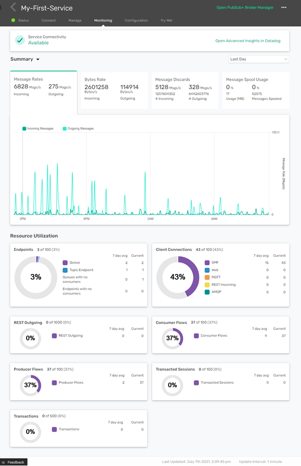
The Monitoring tab is available when you select an event broker service in Cluster Manager. It provides a high-level dashboard with a graphical summary of information, including:
- Event Broker Service Health
- Shown at the top of the Monitoring tab. Your event broker service has one of the following states:
- Available—The event broker service is running and there are no current interruptions.
- Interrupted—There has been anywhere from one to five minutes of interruption time for the event broker service.
- Failed—There have been over five minutes of interruption time for the event broker service.
- Solace monitors these states and investigates interruptions. You can contact Solace for status information of your event broker services.
- Summary
- A dashboard of historical information for your event broker service including messages rates, byte rates, message spool usage, and discard rates.
- Message Rate graph
- A graph showing incoming and outgoing messages rates for your event broker service. You can use the drop-down at the top-right of the graph to select the interval of the information on the graph:
- Last Hour—The last 60 minutes populated with data points aggregated at 20 second intervals.
- Last Day—The last 24 hours populated with data points aggregated at 5 minute intervals.
- Last Week—The last 7 days populated with data points aggregated at 1 hour intervals.
- Last Month—The last 31 days populated with data points aggregated at 4 intervals.
- The numbers shown on the Message Rate chart are an average of the metrics collected over the selected time-interval detailed in the list above. The granularity of the data becomes more coarse as the time frame increases. For more information, see Understanding Time Aggregation. The data in the Messaging Rate chart refreshes based on the Update Interval shown at the bottom-right of the monitoring tab.
- Resource Utilization
-
A dashboard of monitors showing the current, and seven-day average usage of your event broker services resources. The resources monitored include Endpoints, Client Connections, REST Outgoing, Consumer and Producer Flows, Transactions Sessions, and Transactions.
For more information about other collected metrics, see Solace Insights Metrics and Checks.
Understanding Time Aggregation
Time aggregation occurs by averaging the collected data over an interval. For example, to display 8:00 PM on the line chart for a four-hour periodicity, we average all the values from 8:00 PM to 12:00 AM to from a data point. Let’s say in this case, there are three values (100, 335, 500) in that four-hour period, then 312 is the time aggregated value for 8:00 PM. Then, if for the next four hours there are four values (498, 500, 502, 500), then the average is 500.