Solace Insights Advanced Monitoring
Solace Insights provides you with the ability to see historical and real-time metrics in the Solace Cloud Console for your event broker services and to access logs. With Insights, you can also optionally enable Advanced Monitoring for your users, which gives you access to a separate Datadog account and Solace Insights dashboards for Datadog.
To access the rich set of real-time metrics, historical information, and logs, you must have the Insights Advanced Viewer, Insights Advanced Editor, or the Insights Advanced Manager role assigned to your user profile. For more information, see Enabling Solace Insights Advanced Monitoring.
When you use Advanced Monitoring, you can see Solace Insights dashboards provided by Solace. Here's an example of the Estate Overview dashboard:

The various Solace Insights dashboards show you the most relevant information to manage your event broker services and allow you to closely monitor different aspects of your event-driven architecture. The information provided on the dashboards are based on Solace's best practices from working with event broker services.
You can use the Solace Insights dashboards as is, but based on your monitoring needs, you can also create your own Solace Insights dashboards in Datadog. You can even choose to use a mix of predefined dashboards and custom dashboards to monitor your estate. An estate refers to your deployment of event broker services, the messaging and activities that occur, and any capabilities that are part of your account for Solace Cloud (Workspace).
Viewing and accessing the Solace Insights dashboards in Datadog has these advantages:
- The dashboard in the Cloud Console is specific to an event broker service; using Solace Insights dashboards, you can get a view of all of the event broker services in your account (Workspace) while still having the flexibility to navigate to see information for a single event broker service.
- The dashboard in the Cloud Console can't be customized; but using Solace Insights dashboards for Datadog , you can clone any of Solace Insights dashboards that Solace provides. You can customize these cloned dashboards, mix and match information to create your own dashboards that better pertain to your monitoring requirements. When you build your own dashboard, it's important to understand that you have access to hundreds of metrics and many Solace Insights dashboards that come with Insights. You also have access to all the rich data that's collected from the event broker service for your deployment of Solace Cloud.
- The metrics available from Advanced Monitoring give you a more granular-level view of the data. This view can provide a more in-depth understanding on how you are using the event broker services in your estate, understand capacity requirements, and accurately troubleshoot issues.
- In addition to the advanced monitors and metrics, you can view logs and raw data collected from the event broker services. This gives you a way to explore your historical data, investigate anomalies, and troubleshoot.
The Solace Insights dashboards use a mix of metrics, Datadog widgets, and Solace Insights monitors to present information so that you can understand different aspects of your estate. The Solace Insights dashboards and monitors that Solace provides in Datadog contain information that's useful for a number of core monitoring requirements, but generally falls under these two types of categories:
- Operations (or Ops) and Integration
- For these use cases, the teams are interested in getting a summary of information that gives an overview of how the estate is operating. For most Ops and Integration teams, there are key metrics and monitors used to quickly identify critical areas that require attention.
- Applications Support
- Applications Support teams, use the same information as Ops and Integration teams and may find it useful to identify how events flow in their event-driven architecture (EDA). Generally, these teams are interested in a finer-grained level of information to better understand and characterize performance functionality in their applications. Generally, for Applications Support teams, this information is useful to identify any implementation-specific issues or troubleshoot their application.
These dashboards are available to you when you access the Datadog account created for you as part of your Insights subscription and if the user profile Solace Cloud has been assigned the Insights Advanced Viewer, Insights Advanced Editor, or the Insights Advanced Manager role.
The Solace Insights dashboards have a collection of monitors and metrics grouped together on a page. You can use these Solace Insights dashboards to understand your estate, but you cannot modify them. If you require a customized dashboard, we recommend that you clone one of the Solace Insights dashboards of your choice and use it as at starting point for your own dashboard.
For information about:
-
General information about each of the dashboards. For more information, see Common Information about Advanced Monitoring Solace Insights Dashboards for Datadog.
-
Enabling advanced monitoring for Solace Insights, see Enabling Solace Insights Advanced Monitoring.
-
Reusing clones of existing dashboards for your use, see Extending Advanced Monitoring.
Common Information about Advanced Monitoring Solace Insights Dashboards for Datadog
The Solace Insights dashboards for Datadog that Solace provides for advanced monitoring have a collection of monitors and metrics grouped together on a page which each dashboard sharing similar characteristics that you should be familiar with so that:
- you easily interpret them and best use the dashboard
- you can navigate from one dashboard to another and be able to interpret, explore, and use the dashboard
For specific detailed information about what's available for each dashboard, see Understanding Solace Insights Dashboards for Advanced Monitoring.
Here's a summary of common aspects for each Solace Insights dashboards:
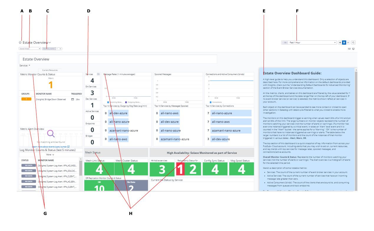
- Title of the board—The name of the board that gives you an understanding of the theme and purpose of the dashboard. You can click the name to see a quick overview of the dashboard.
- Saved Views—Views permit you save filters you've set to bring up filter data again. For more information, see "Saved views" on the Template Variables page in the Datadog documentation.
- Data Filters—Use these to filter your data based on the event broker service name or other information (such as queue name). For more information, see Data filters.
- Metrics—The metrics in the dashboard. Ones near the top are considered high interest based on the theme of the dashboard.
- Brief description—A short description of the dashboard and notable metrics that is commonly interesting to variety of customers. For a detailed description of the dashboard, see, Understanding Solace Insights Dashboards for Advanced Monitoring.
- Time Filters—You can filter and traverse through historical data based on a selected time interval of interest. You can also reference the field to determine the time zone of the information you're viewing: UTC (Universal Coordinated Time) appears above the field if data is in the UTC time zone, otherwise the information is in your default time zone. For more information, see Time filters
- Monitor Summary widgets—Datadog widgets that list information about monitors.
- Sections—Each dashboard is organized as multiple sections to logically group widgets and their information together.
These are the common characteristics of each dashboard that you should familiarize yourself with to assist with monitoring your estate:
- Color-coded Warnings and Alerts
- The metrics and monitors are color-coded in a manner to give you a quick understanding of what's occurring in your estate. For more information, see Understanding the Color Codes.
- Filtering
- On each dashboard the metrics, charts, and tables can be filtered using the data filter and time filter. When you select a time interval or specify a data filter, all widgets utilize the selected filters. For more information about using filtering, see Data and Time Filters.
- Interacting with the widgets (or objects) to further explore metric and monitor details
- Each object on the dashboard can be expanded or selected to see more context or open other sections. When you interact with a widget, it allows you to see different and deeper levels of detail. The levels of detail permit you to explore the data and perform more in-depth analysis. For more information, see Interacting with the Dashboard.
Understanding the Color Codes
On the Solace Insights dashboards for Datadog, we use consistent color coding to provide you with visual cues to the various states of metrics and monitors. The colors are associated to the severity of various thresholds that are monitored or tracked via the Monitor Summary widgets for metrics on the dashboards. Here's how the colors are generally used in the metrics, exceptions will be noted in the description of the metric:
- Red is associated with the Alert severity level and is deemed critical and potentially service impacting or near-service impacting. In most cases, metrics show this when 95% of a threshold is reached.
- Yellow is associated with the Warn severity level and is deemed something that may require your attention. For thresholds, this is the 80% threshold for monitoring metrics. In most cases, metrics show this when 80% of a threshold is reached.
- Green is associated with the OK severity level. It indicates that event broker services are running as expected and that the Warn or Alert severity levels have not been triggered. In all cases, green indicates that things are operating as expected and within the set parameters.
- Grey indicates that there is no data available or has been available in a period of time. It can also indicate that the metric or monitor is not applicable for the selected time interval.
Data and Time Filters
There are data and time filters available on the dashboards that include filtering based on the name of the event broker service and time intervals. By default all dashboards can be filtered by the event broker service name denoted by the $service_name located at the top-left of the
dashboard and the date-range filter on the top-right of your dashboard. If no event broker service is selected, the metrics that are shown reflect all services in your account.
Data filters
Each page has the $service_name template variable that permits you to filter the data and metrics based on the name of the event broker service. The filtering you do is useful to refine the data on the selected interval and show
metrics and monitoring information on specific criteria. All widgets on a dashboard are associated with this template variable, so as you use the
data filter, the values on the widgets change to reflect what you have selected.
By default, no filtering is done on the dashboard because (*) is selected. Some dashboards have other predefined data filters available,
such as the $queue_name filter. You can use a combination of filters to further refine and perform multi-level filtering of the
information that is shown on the dashboard. For example, if you wanted to show information for a particular event broker service and queue, you could use the $service_name and $queue_name
to filter the data shown to perform a useful analysis on a particular queue.
The following list summarizes the predefined filters provided on the Solace Insights dashboards for Datadog Solace Insights.
$service_name- This filter is available on all Solace Insights dashboards and allows you to filter the information shown based on the name of the event broker service in your estate. The name of event broker service is what you had provided when you created it in Cluster Manager.
Sbridge_name- This filter is available on the Bridges Overview dashboard and is based on the name of the Message VPN bridge in your estate.
Squeue_name- This filter is available on the Queues Overview dashboard and is based on the name of the queue in your estate.
Srdp_name- This filter is available on the REST Delivery Point (RDP) Overview dashboard and is based on the name of the REST Destination Point (RDP) in your estate.
env- All Insights dashboards can be filtered by environment. If your organization has created multiple environments, you can filter a dashboard by a specified environment, causing it to show only data about event broker services in the specified environment. This option is useful if you want to understand information about an specific environment. For more information about environments, see Creating and Managing Environments.
Time filters
You have the ability to view historical data and even see how the data changes on your dashboard over a selected interval of time based on the logs retained in Datadog. Logs are kept for 30 days by default. You can contact Solace to request an extension of up to 90 days.
This uses the Global Time Selector widget from the Datadog screenboard. Here's what's provided to you:
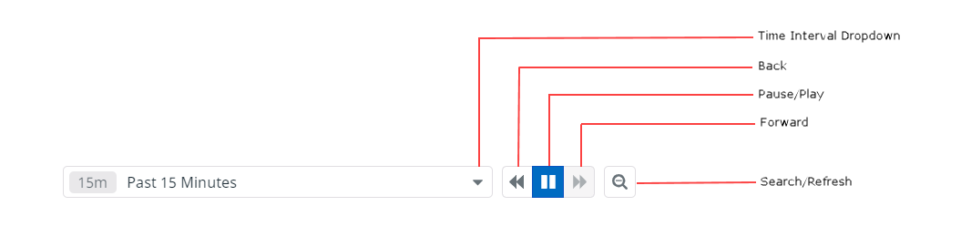
- Time Interval drop-down
- At the top-right of the dashboard, the date range permits you decide how to filter the time based on the selected time interval. Based on the selected interval, you can use the Rewind button and Forward button to view the historical data based on the selected time interval that you selected. This capability is useful to see how metrics and monitors change to let you analyze changes to your estate.
- The time intervals are as follows:
- Past 5, 15, 30 minutes
- Past 1 or 4 hours
- Past 1 or 2 days
- Past week
- Past 1 month
- Custom views
- Time Interval Navigation
- Beside the time range are the following buttons that permit to you browse and traverse the data using the selected time interval. Pressing the
following various buttons lets you change the data shown on the dashboard:
 (Back): Scroll back to the previous time interval and refresh the dashboard with that information.
 (Pause) or
  (Play): You can pause the metrics to pause the real-time updating of the information on the dashboard. After
you pause the metrics, the button changes to Play , which allows you to resume updating of information on the dashboard.
(Play): You can pause the metrics to pause the real-time updating of the information on the dashboard. After
you pause the metrics, the button changes to Play , which allows you to resume updating of information on the dashboard. (Forward): Scroll forward by interval up to the present interval. This button is available only if there
are time intervals to which to forward.
(Forward): Scroll forward by interval up to the present interval. This button is available only if there
are time intervals to which to forward. (Search/Refresh): Searches for metrics in the time interval and actively refreshes the dashboard.
- Time Interval Time Zone
- By default, the times shown by the various visualizations on your dashboards will be based on your browser time zone. Your browser time zone is
the determined by your system time zone, which itself set based on your geographic location. In Datadog you can switch a dashboard to display
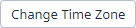
the time in UTC (Universal Coordinated Time) instead of the default browser time zone. To do that click the
 icon in the top right corner of the screen and select one of the following options (the option available will be the
opposite of the time zone currently displayed):
icon in the top right corner of the screen and select one of the following options (the option available will be the
opposite of the time zone currently displayed):- Display default timezone
- Display UTC time

- You can change the default browser time zone in Datadog using the Personal Settings screen . Access your Personal Settings by clicking on your
user name, located in the bottom left corner of the Datadog screen, then clicking Personal Settings > Preferences >
 . The Select your time zone window will open where you can select your a new default time zone using the
provided map or fields.
. The Select your time zone window will open where you can select your a new default time zone using the
provided map or fields.
Interacting with the Dashboard
On the Solace Insights dashboards for Datadog, we use many of the Datadog widgets and predominately the Query widgets (for metrics), Timeseries widgets (for trends), and Monitor Summary widgets (for aggregating monitor information). Many of the widgets can be clicked and expanded to show a full-screen mode for additional analysis of the details and addition information.
All visualizations are based on the selected time interval chosen and you can change what is shown in the widget using data filters and time filters.
The metrics, monitor counts, and tables have been configured to filter out the Solace-specific internal objects generated as part of the services' internal operations. For example, the queues that are generated for Config-Sync activities are filtered out of the results to focus dashboards on the overall event broker service operations without the clutter of the internal objects.
The following are the most common widgets. We provide a high-level description about how to use them with references to the Datadog documentation for more details:
- Query Value
- Tables
- Top List
- Monitor Summary
- Event Timeline
- Log Stream
- Event Stream
- Check Status
- Host Map
- Timeseries
Query Value
The Query Value widget is often used to show metrics. For this widget, you can see the query and options to view full screen, etc. For more detailed information, see the Query Value Widget in the Datadog documentation.
You can click the widget to get a menu of the following items in a pop-up menu:
- METRIC: The query to get the metric. You can click this entry to copy the query.
- View in full screen: Opens the widget in full screen and gives you a graph view to navigate the history of the metric. There are
also a number of view-related items that are useful for investigation and troubleshooting. In full screen mode, you can perform additional
actions including:
- On the metric value, click
 and select one of the following actions:
- Copy: Copy the widget JSON schema definition.
- Copy query to clipboard: Copies the query used to get metric to the clipboard.
- Declare incident: Not used with Solace Cloud.
- Export to dashboard: You can export the information you have transformed to a clone of the dashboard or a custom dashboard that you created.
- Export to incident: Not used with Solace Cloud.
- On the graph of the metric, click and select one of the following actions:
- Copy: Copy the widget JSON schema definition.
- Copy query to clipboard: Copies the query used to get metric to the clipboard.
- Declare incident: Not used with Solace Cloud.
- Export to dashboard: You can export the information you have transformed to a clone of the dashboard or a custom dashboard that you created.
- Export to notebook: Not used with Solace Cloud.
- Export to incident: Not used with Solace Cloud.
- Download as CSV: Download a CSV file (comma-delimited) of metric values.
- You can optionally use the time filter to get different views of that metric. For more information about using the time filter, see Time filters.
- On the metric value, click
- View related processes: Not used with Solace Cloud.
- View related containers: Not used with Solace Cloud.
- View related hosts: Not used with Solace Cloud.
- View related logs: View the related logs collected from your event broker services.
- View related traces: Not used with Solace Cloud.
You can also get addition information from the widget about the metric using these options located on the top-right corner of the widget:
- Show the Widget in Full Screen
 : Click the metric to open the widget in full screen and gives you a graph view to navigate the history of the metric. You can
optionally use the time filter to get different views of that metric.
: Click the metric to open the widget in full screen and gives you a graph view to navigate the history of the metric. You can
optionally use the time filter to get different views of that metric. - Other
: Click and select one of the following options from the drop-down menu:
- Copy: Copy the widget JSON schema definition.
- Declare an Incident: Not used with Solace Cloud.
- Export to Incident: Not used with Solace Cloud.
- Download as PNG: Download a snapshot of the metric as an image (PNG).
Top List
The Top List widget is often used for top ten information based on the dashboard. For example, on the Queues board, it would be the top queues. For more detailed information, see the Top List Widget in the Datadog documentation.
Click an entry in the list to get a menu of the following items in a pop-up menu:
- The query to get the metric. You can click this entry to copy the query.
- View in full screen: Opens the widget in full screen and gives you a graph view to navigate the history of the metric. You can optionally use the time filter to get different views of that metric. For more information about using the time filter, see Time filters.
- View related processes: Not used with Solace Cloud.
- View related containers: Not used with Solace Cloud.
- View related hosts: Not used with Solace Cloud.
- View related logs: View the related logs collected from your event broker services.
- View related traces: Not used with Solace Cloud.
You can also get addition information from the widget about the metric using these options located on the top-right corner of the widget:
- Show the Widget in Full Screen
: Click the metric to open the widget in full screen and gives you a graph view to navigate the history of the metric. You can
optionally use the time filter to get different views of that metric.
- Other
: Click and select one of the following options from the drop-down menu:
- Copy: Copy the metric or monitor to copy to a dashboard you create or cloned.
- Declare an Incident: Not used with Solace Cloud.
- Export to Incident: Not used with Solace Cloud.
- Download as PNG: Download an image (PNG) of the table .
- Download as CSV: Download a CSV file (comma-delimited) of the contents of the table.
Monitor Summary
The Monitor Summary widget shows a summarized subset of the Solace Insights monitors for Datadog based on the configured query.
Monitor Summary widgets generally configured to trigger a warning when values reach 80% of a limit and an alert at 95% of the limit. The large numbers on Monitor Summary widgets represent the number of monitors watching your event broker services (not to be confused with the number of alerts or warnings). If a Monitor Summary widget has even one instance of a Datadog monitor triggered by a critical event, it raises an Alert level event and it is counted in the Alert bucket - the same applies for a Warning. The meaning of OK in a Monitor Summary widget indicates that there are no monitors that were triggered as warnings or alerts.
The Monitor Summary widget may be filtered down to reflect the context of the dashboard or the title of the widget. For example, on the Estate overview, it would be all the dashboard's various monitors. For more detailed information, see the Monitor Summary in the Datadog documentation.
You can click on the any of the summary numbers or the list of monitors to view the monitor on it's own page or if available, you can click on an individual monitor listed to open a view to details about the selected.
You can also click the Other in the right hand corner of the widget or the right corner of a monitor number and then select one of the following options from the
drop-down menu:
- Copy: Copy the metric or monitor to copy to a dashboard you create or cloned.
- Declare an Incident: Not used with Solace Cloud.
- Export to Incident: Not used with Solace Cloud.
- Download as PNG: Download an image (PNG) of the widget or the monitor.
Event Timeline
The Event Timeline widget is used to give an overview of information as a timeline, such as when Alerts have occurred in your deployment. This chart reflects the selected time frame in the top-right control on the dashboard. You can also drag the time series chart on the widget to change the time filter, which also updates the time filter on the top-right of the dashboard. For more information about selecting the time interval, see Time filters. For more information about the Event Timeline Editor, see the Datadog documentation.
You can click Other in the right hand corner of the widget and select one of the following options from the drop-down menu:
- Copy: Copy the widget JSON schema definition.
- Declare an Incident: Not used with Solace Cloud.
- Export to Incident: Not used with Solace Cloud.
- Download as PNG: Download the timeline as an image(PNG).
Log Stream
The Log Stream widget shows the key event broker system and command logs from the event broker service in your deployment. For information about Log Stream widget, see the Datadog documentation.
You can click individual logs and open it to see more details about the key logs monitor in the Log Explorer view. That view allows you to further analyze the logs to perform troubleshooting on separate page:
- further performing filter logs
- aggregate the logs by fields, patterns or transactions
- navigate each log to see more details
- optionally use the time filter to get different views of that metric (see Time filters for more information)
You can click Other in the right hand corner of the widget and select one of the following options from the drop-down menu:
- Copy: Copy the widget JSON schema definition.
- Declare an Incident: Not used with Solace Cloud.
- Export to Incident: Not used with Solace Cloud.
- Download as PNG: Download the shown logs as an image (PNG).
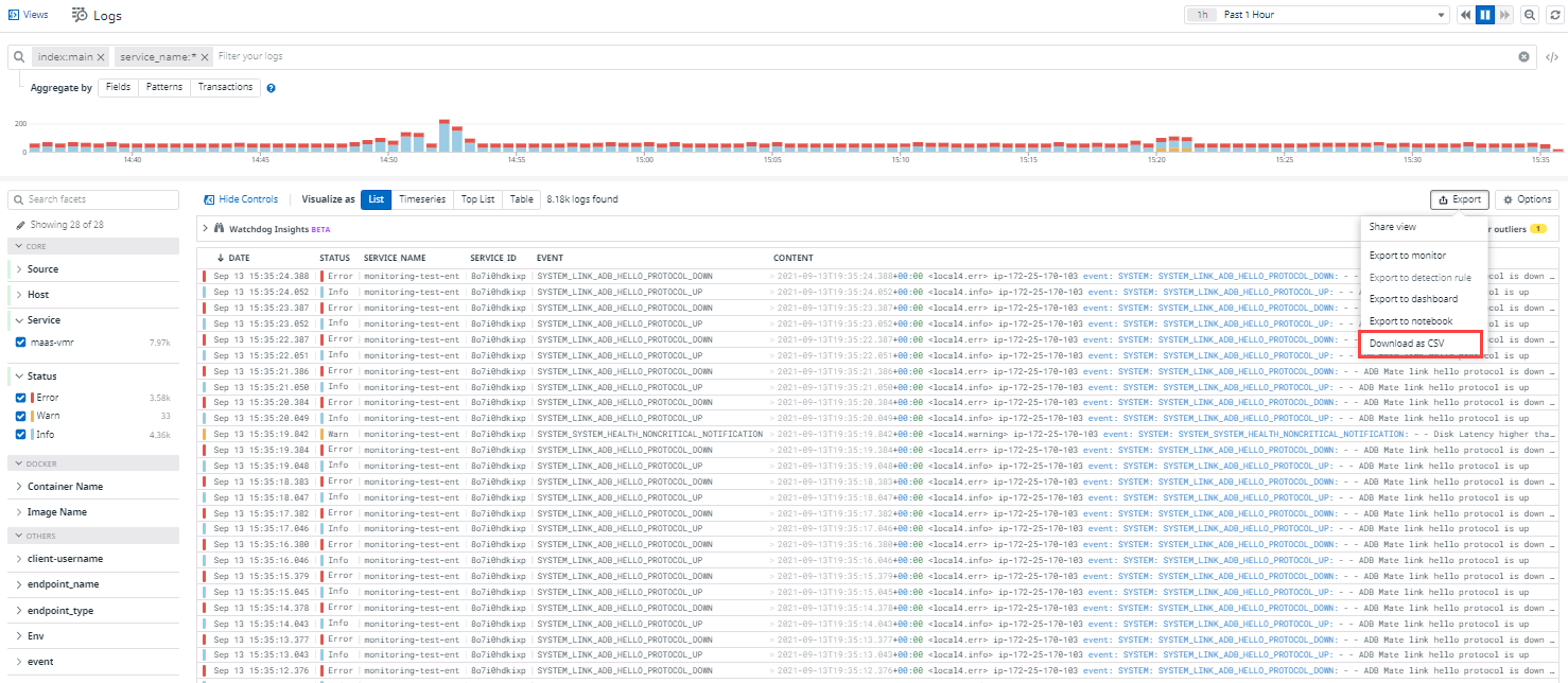
If you click the Open in Log Viewer button, in the Logs portion of Datadog, you can perform actions that visualize the logs in different ways as
well as organize, and filter the logs. You can also export the logs to a monitor, dashboard, or CSV. For example, below is an illustration showing
how to export the logs to a CSV file. For more information, see Log Explorer in the Datadog documentation.
button, in the Logs portion of Datadog, you can perform actions that visualize the logs in different ways as
well as organize, and filter the logs. You can also export the logs to a monitor, dashboard, or CSV. For example, below is an illustration showing
how to export the logs to a CSV file. For more information, see Log Explorer in the Datadog documentation.
Event Stream
The Event Stream widget is used to show Datadog events that are triggered by the monitors (not events passed between event broker services). You can click each event to get more information about the event to further understand the corrective action, and details of the event. You can also further investigate the course of events, including information in related logs, and the Datadog monitor information.
You can click Other in the right hand corner of the widget and select one of the following options from the drop-down menu:
- Copy: Copy the widget JSON schema definition.
- Declare an Incident: Not used with Solace Cloud.
- Export to Incident: Not used with Solace Cloud.
- Download as PNG: Download the shown logs as an image (PNG).
Check Status
The Check Status widget shows the current status or number of results for any check that was made. In the Check Status widget, you can see the combinations of tags for each item count based on the status number you clicked in the widget. For example, the number of event broker services up. For more information about the Check Status widget, see the Datadog documentation.
You can click the value shown to see a dropdown list of the checks that were made.
You can also click Other in the right hand corner of the widget and select one of the following options from the drop-down menu:
- Copy: Copy the widget JSON schema definition.
- Declare an Incident: Not used with Solace Cloud.
- Export to Incident: Not used with Solace Cloud.
- Download as PNG: Download the value show in the widget as an image (PNG).
Host Map
The Host Map widget is customized to report general metrics pertaining to a host to provide a health status of the host using the various color codes (see Understanding the Color Codes). It provides graphical representations that are selectable allowing you to drill-down and further analyze details of a host. For example, we indicate the status and health of High-availability (HA) event broker services. For more information about the Host Map widget, see the Datadog documentation.
When you click on a graphical representation of a host, you can select one of the following actions from the pop-up menu:
- METRIC: The query to get the metric. You can click this entry to copy the query.
- Template variables: You can set the
$service_namedata filter to the event broker service that the graphic represents in the host map. - View in Full Screen: Puts the host map view in full screen. From this mode, you can click the host information and see more specific information. In the context of HA, you can select each event broker to see information about the details about the event broker that includes the name, container, deployment details, performance, etc.
- Copy tags to clipboard: Copy the tags for the item to the clipboard. In the case of the host, its the hostname and service name.
- View related processes: Not used with Solace Cloud.
- View related containers: Not used with Solace Cloud.
- View host dashboard: View information about the selected item. In the case of hosts, opens up various metrics about the instance that include CPU usage, process memory usage, disk usage, memory, disk latency to permit to you analyze what's occurring on the physical host.
- View related logs: View the related logs collected from your event broker services.
- View related traces: Not used with Solace Cloud.
You can also get addition information from the widget about the information in the Host Map widget using the options located on the top-right corner of the widget:
- Show the Widget in Full Screen
: Open the widget in full screen. From this mode, you can click each host to see more details about the it. You can also scroll to
zoom in and out.
- Other
: Click and select one of the following options from the drop-down menu:
- Copy: Copy the widget JSON schema definition..
- Declare an Incident: Not used with Solace Cloud.
- Export to Incident: Not used with Solace Cloud.
- Download as PNG: Download an image (PNG) of the current status of the Host Map widget.
Timeseries
A Timeseries widget provides a visualizations of data over a time interval (usually a line graph), which allows for better analysis of changes over a time interval and to understand the rate of change. To investigate details, you can zoom into a time interval to see details of the a time interval. For more information about the Timeseries widget, see the Datadog documentation.
You can click the widget to open it in full-screen mode to:
- apply transforms on the data to better understand the data that's being visualized such as Trend Lines, Basic Anomalies, Linear Forecast, Derivatives, Cumulative Sums
- compare information over time in both linear and logarithmic means
- optionally use the time filter to get different views of a metric over a time interval. The usage is similar to how to use Time Filters. For more information, see Time filters.
-
drag and select a window of time on the graph which acts the same as a custom filter in the Time filter on the dashboard, which impacts the data on all other Timeseries widgets on the dashboard.
In full-screen mode for the visualization, you can click Graph and select one of the following from the drop-down menu:
- Copy: Copy the widget JSON schema definition.
- Copy query to clipboard: Copies the query used to get the datapoints in the visualization as a JSON query.
- Declare incident: Not used with Solace Cloud.
- Export to dashboard: You can export the information you have transformed to a clone of the dashboard or a custom dashboard that you created.
- Export to notebook: Not used with Solace Cloud.
- Export to incident: Not used with Solace Cloud.
- Download to CSV:Download a CSV file (comma-delimited) of the contents of datapoints used for the visualization.
On the widget, on top-right side of the widget, you can click the following:
- Show the Widget in Full Screen
: Open the visualization in full screen view.
- Other: Click and select one of the following options from the drop-down menu:
- Copy: Copy the widget JSON schema definition.
- Declare an Incident: Not used with Solace Cloud.
- Export to notebook: Not used Solace Cloud
- Export to Incident: Not used with Solace Cloud.
- Download as PNG: Download an image (PNG) of the data used for the visualization.
- Download as CSV: Download a CSV file (comma-delimited) of the contents of datapoints used for the visualization.
- Other
Tables
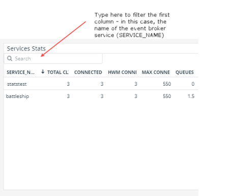
On each dashboard (usually near the bottom) you will find a summary table that provides an overview of the various metrics and collected information in columns by tag key. This uses a Table widget from Datadog. For more information, Table widgets in the Datadog documentation.
This table can be sorted and filtered on a relevant key based on the dashboard, such as then name of the event broker service, Message VPN bridge, or REST Destination Point (RDP) as examples.
All tables on this dashboard show up to 100 rows. All table interactions are for the entire set of possible rows. You can click on the column headers to sort the entire list and show you the top (or bottom) 100 rows based on the sorted metric. You can also type in the Search field to filter the results. For example, in this summary table, you can filter by the name of the event broker service.
Other interactions with the Table widget:
You can hover your cursor over a column heading to get the full name. In most cases, the names are truncated.
You can click an entry in the table so that a pop-up menu appears and do the following:
- Set
<data_filter>to<selected_entry>: You can click on an<selected entry>and set the<data filter>for the table to use that value, where<selected entry>is the entry in the table you selected and<data_filter>is the table's filter (template variable), such as$service_name. - View in full screen: Opens the widget in full screen, which also provides a graph view to navigate the history of the metric. You can optionally use the time filter to get different views of that metric.
- View related processes: Not used with Solace Cloud.
- View related containers: Not used with Solace Cloud.
- View related hosts: Not used with Solace Cloud.
- View related logs: View the related logs collected from your event broker services.
- View related traces: Not used with Solace Cloud.
You can also get additional information from the widget about the metric using these options located on the top-right corner of the widget:
- Show the Widget in Full Screen
: Click the table in full-screen. You can search for stats and also use the time filter to control the interval of
data that's shown in the table.
- Other
: Click and select one of the following options from the drop-down menu:
- Copy: Copy the metric or monitor to copy to a dashboard you create or cloned.
- Declare an Incident: Not used with Solace Cloud.
- Export to Incident: Not used with Solace Cloud.
- Download as PNG: Download an image (PNG) of the table.
- Download as CSV: Download a CSV file (comma-delimited) of the contents of the table.